78 Hotel, 2019 - 2020 Read more {{currentSlide}}/{{total}}
Narrative:
This is one of the oldest Chinese Medicinal companies in existence. The Hotel is contained within the grounds of its Campus containing a Factory, R&D centre, head office and Museum. Daily tours are operated in the facility and the 5 star hotel will expand the tourist capacity of the site.
Erjiao is considered an important supplement for women and it is believed to bring inner balance. Erjiao exists in a number of states from a viscous liquid when stored it is cast into dried translucent ingots. It is in this viscious state when consumed though the melting process generates a geometric curved form from which we harnessing throughout the scheme.
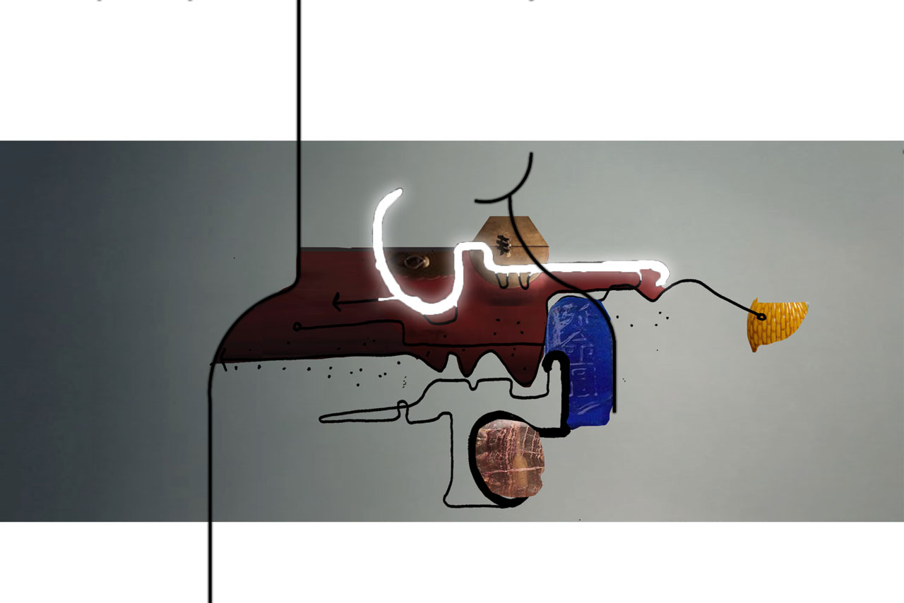
Referencing Brand Calligraphy a series of gestures, grammar and markings can be understood infusing differing emotions and feelings within a body of text or Character. Viewing a Character as a series of moments we can overlap into a layered composition. We can use this as a metaphor in a design situation substituting the pen for a body sequential movements invoking experiences the combination of which can be viewed as a procession route, a layered collage of fleeting moments.
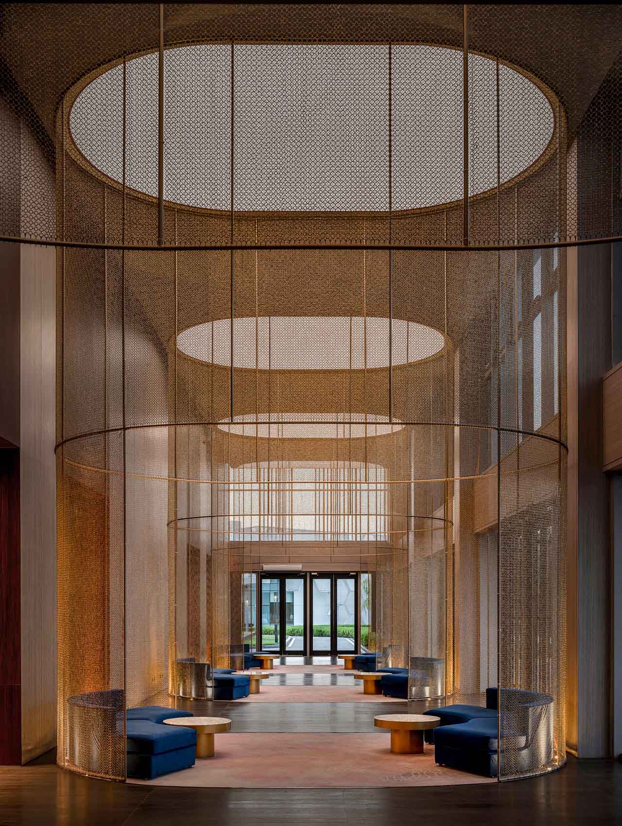
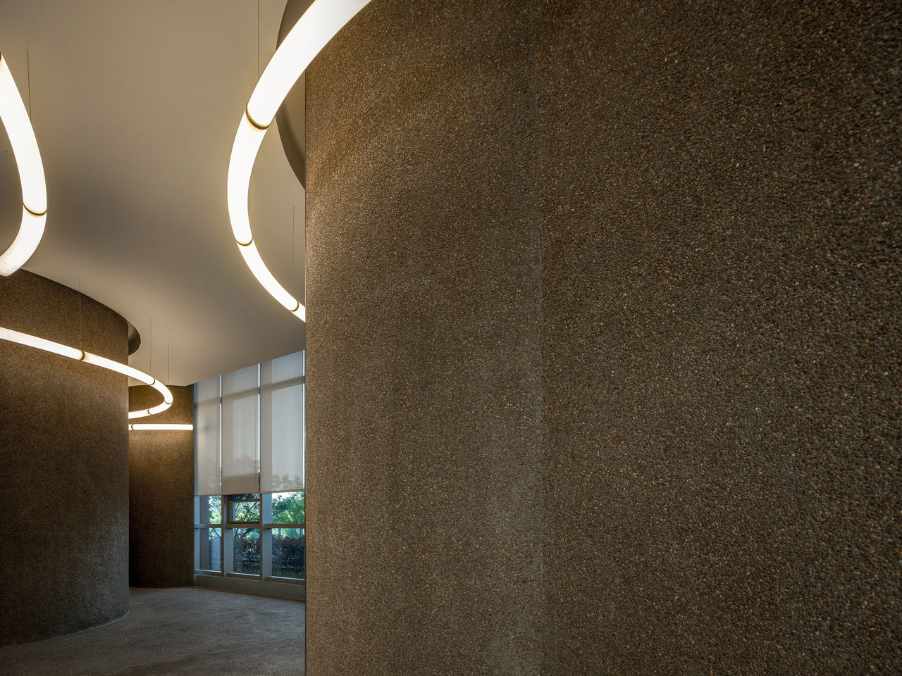
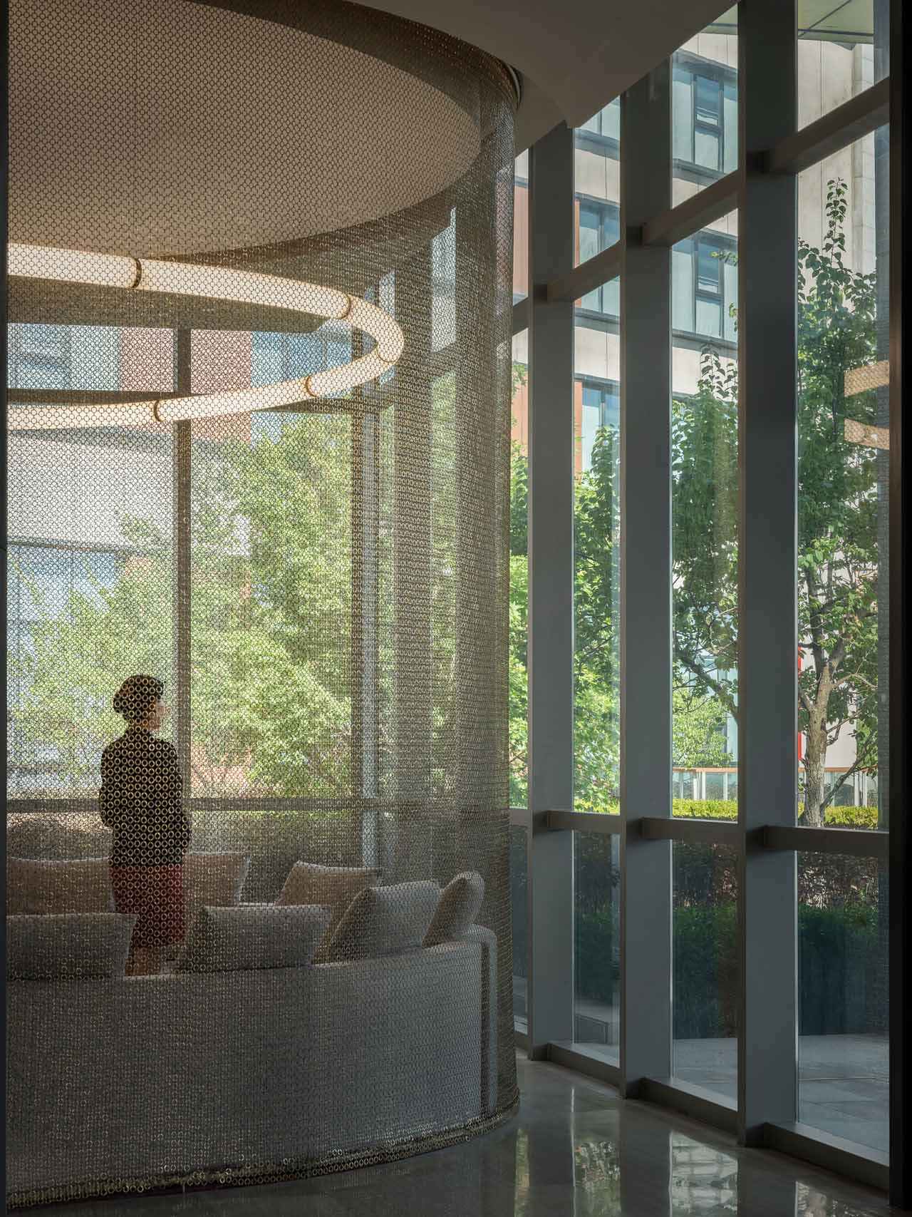
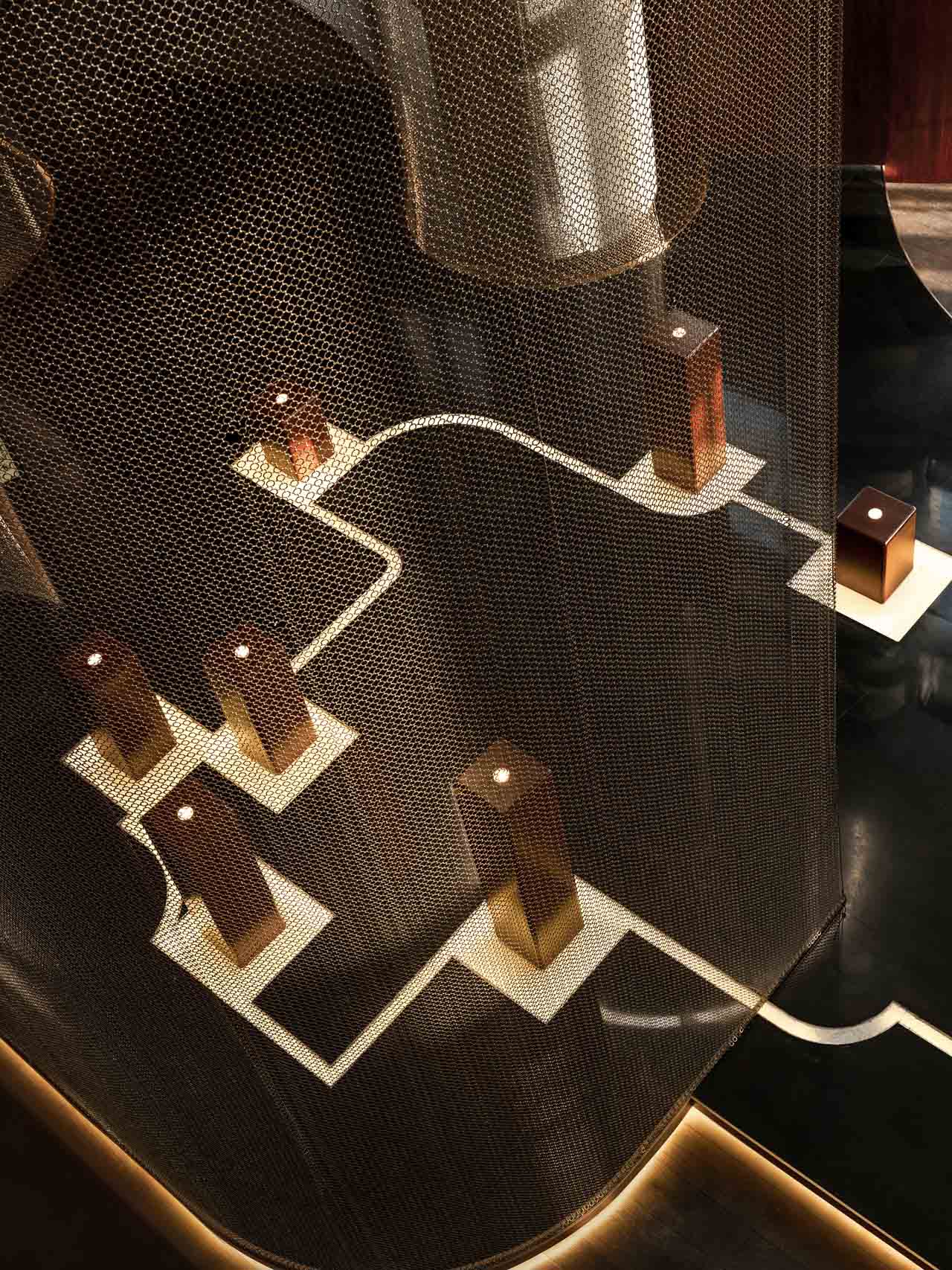
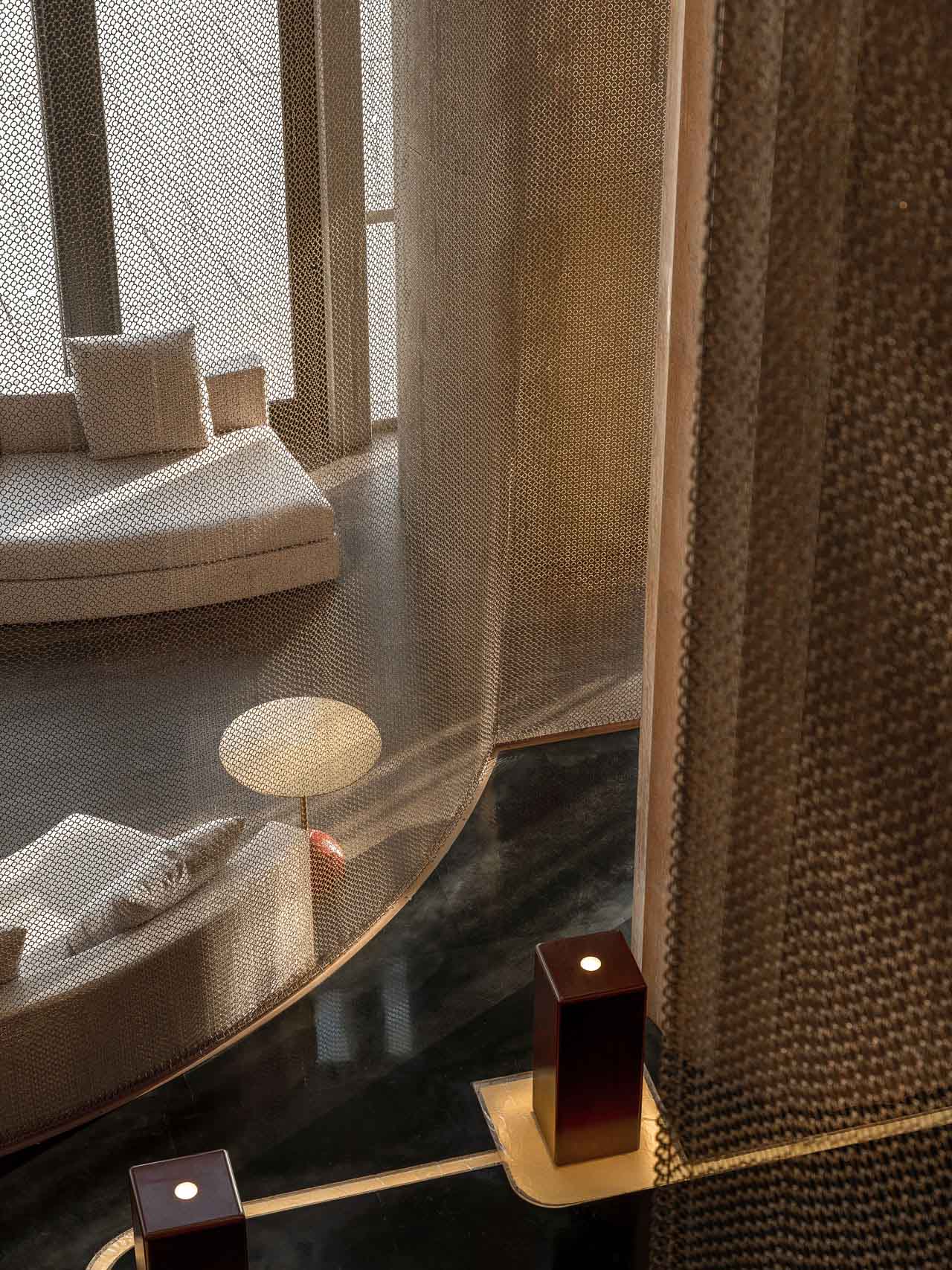
The control of light within the sequential routes effects the emotional temperature in the space. Attention was given to materials which can soften and effect how the guest can interrupt volumes and the emotions conjured as a result. Materials such as 1.Rough aggregates 2. Glass bricks 3. Linked mesh 4. Lacquered wood 5. Yellow marble, were chosen due to their qualities to impart our interrupted identity of the brand.
Accommodation:
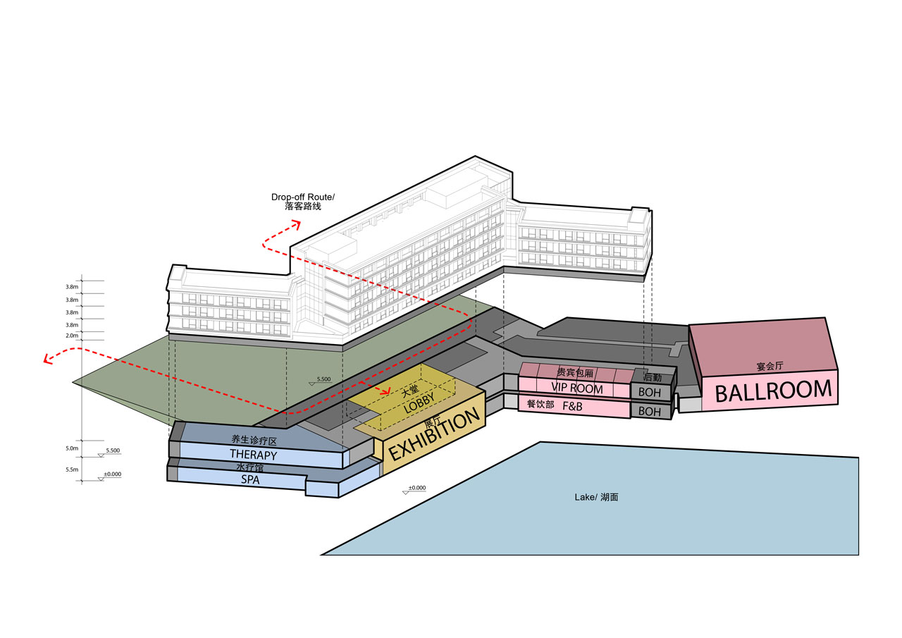
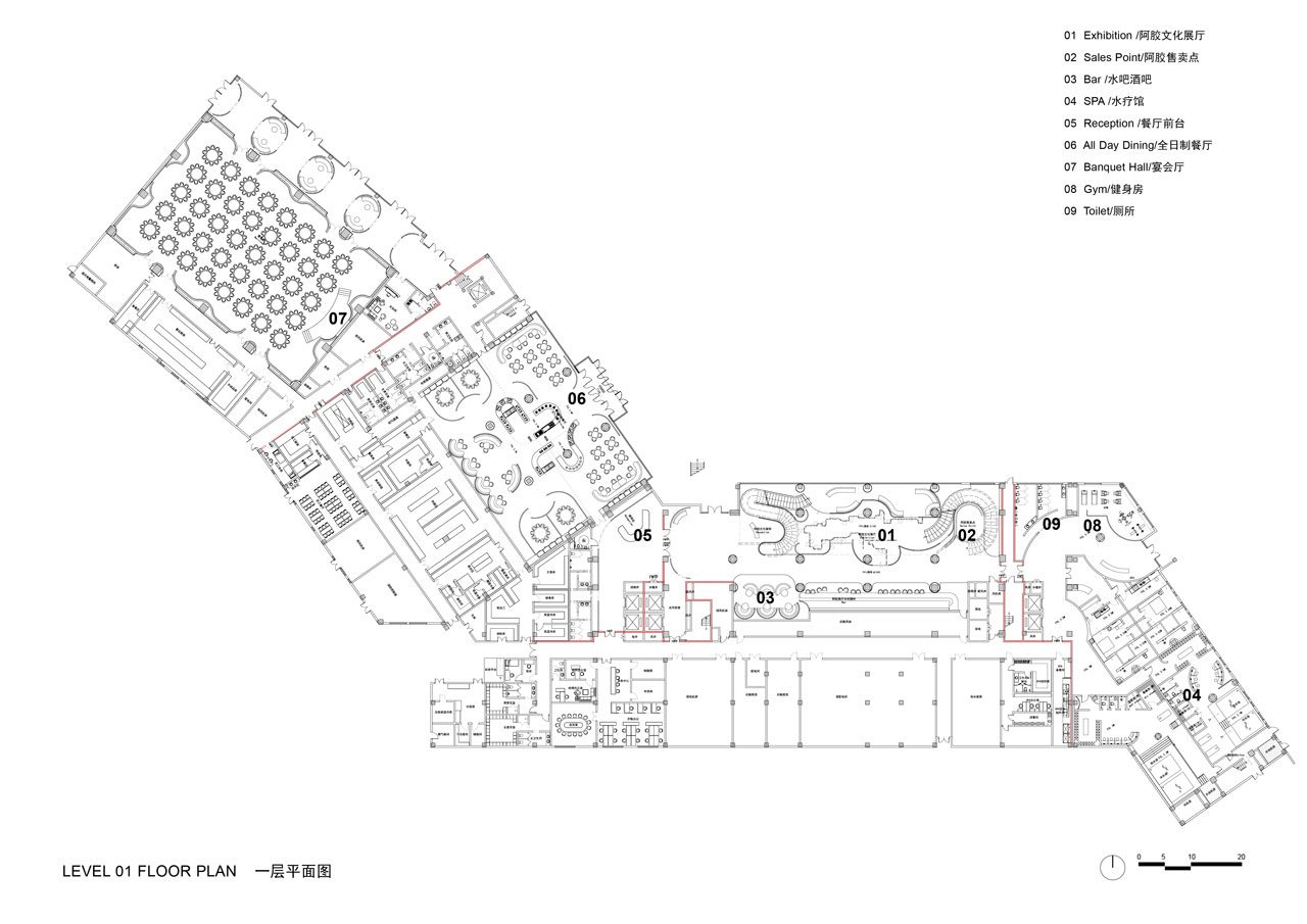
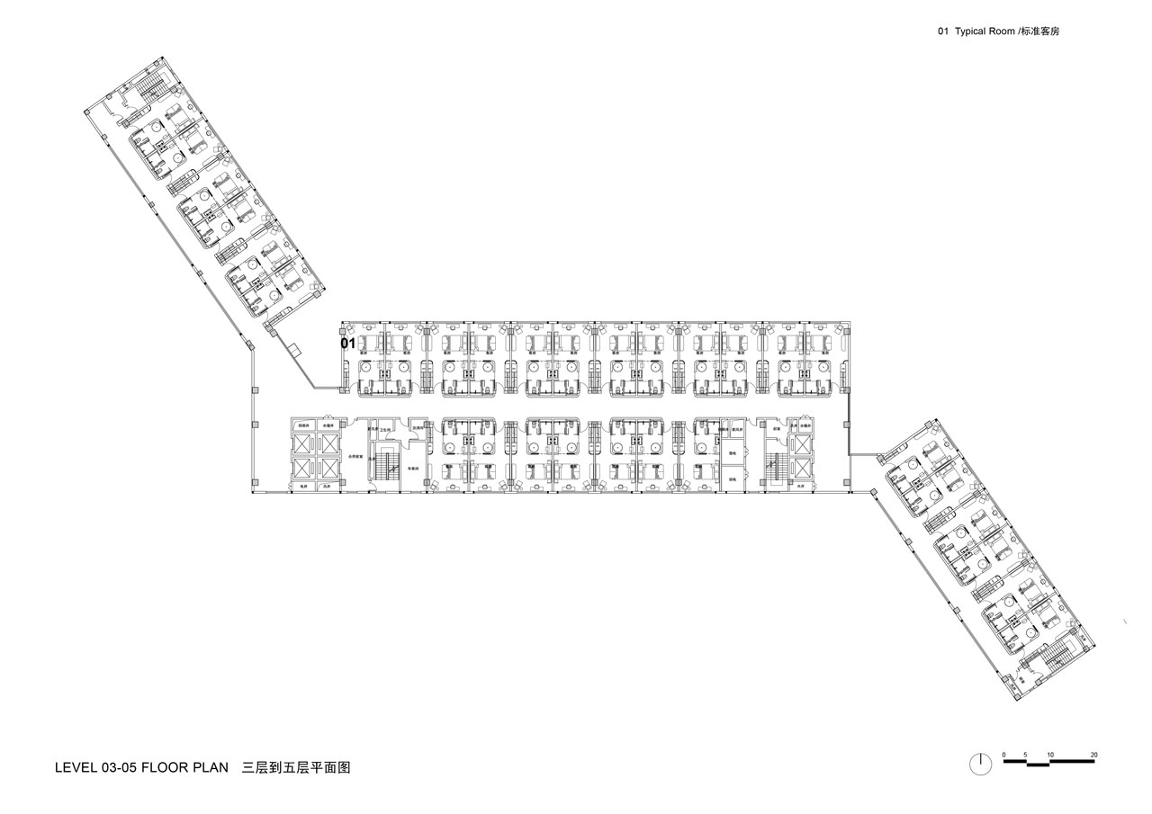
waa was commissioned to design the hotel that was intended to be operated by the clients in-house team. The 5 Star resort Consisted of a luxury spa, executive function spaces, grand ball room and multiple F+B destinations. The building which is spread over 3 wings and 8 stories in height, encompasses 150 guest rooms.
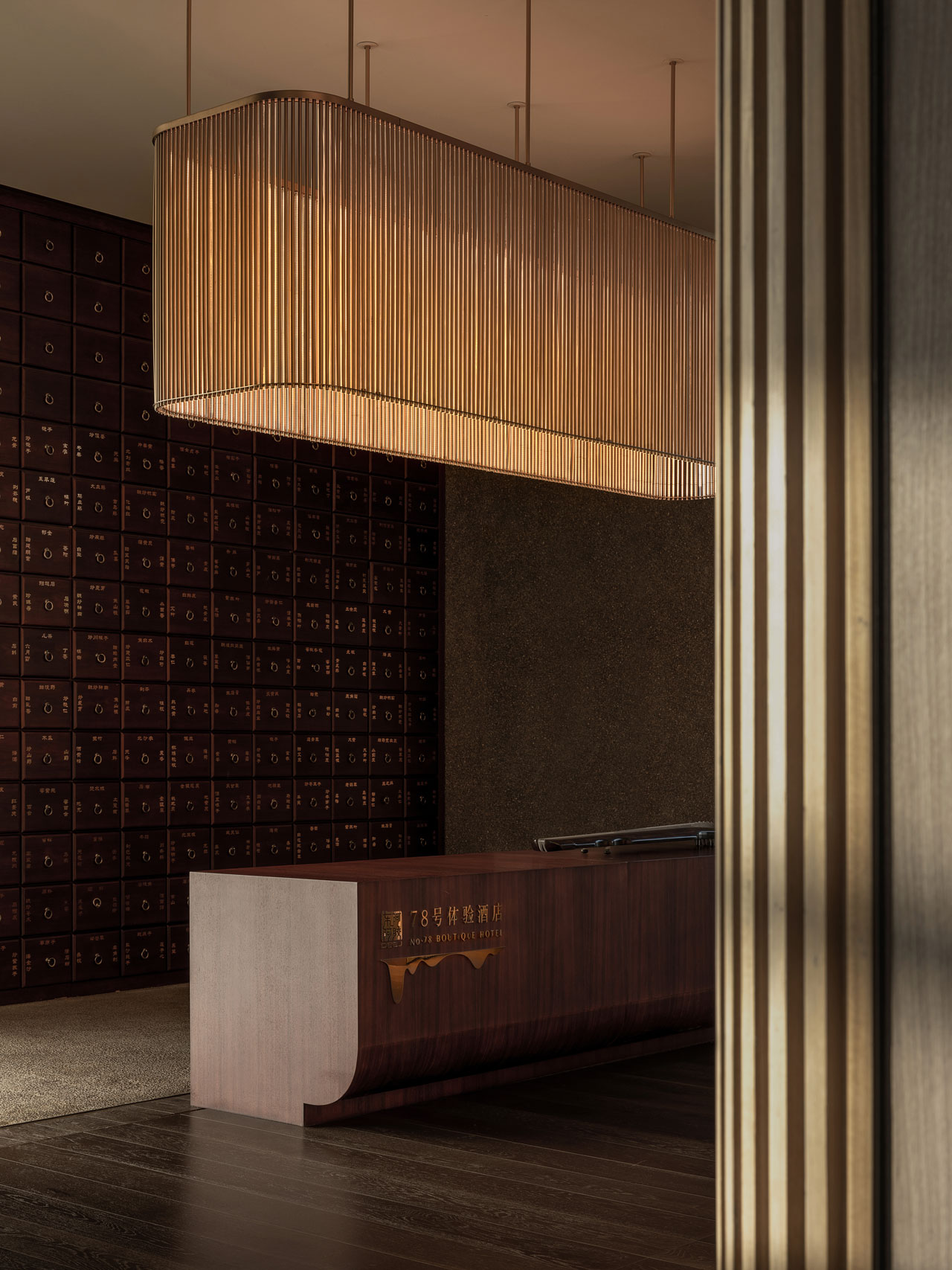
- Foyer and reception: Guests arrive on level 2 through a raised drop off. Two pigmented glass brick walls create an illuminated backdrop for the reception desk suggesting to the guest a short brief exchange. The mezzanine overlooks the campus lake and has panoramic views into the campus grounds
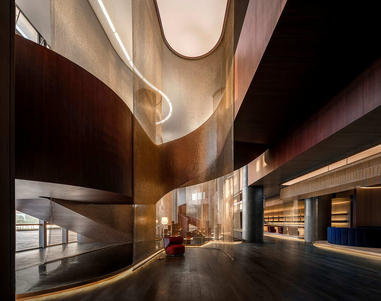
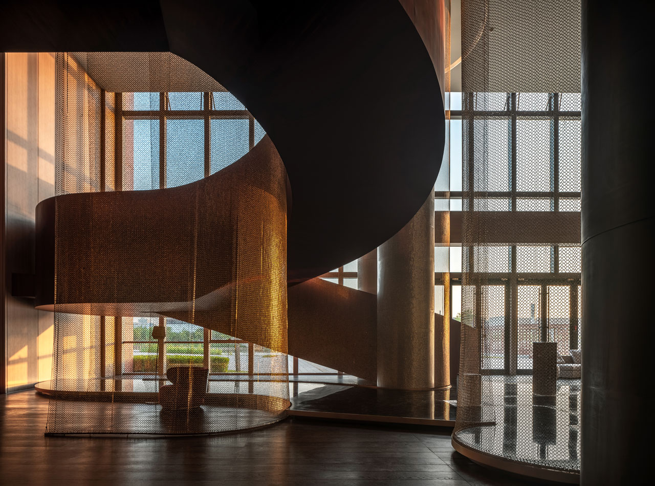
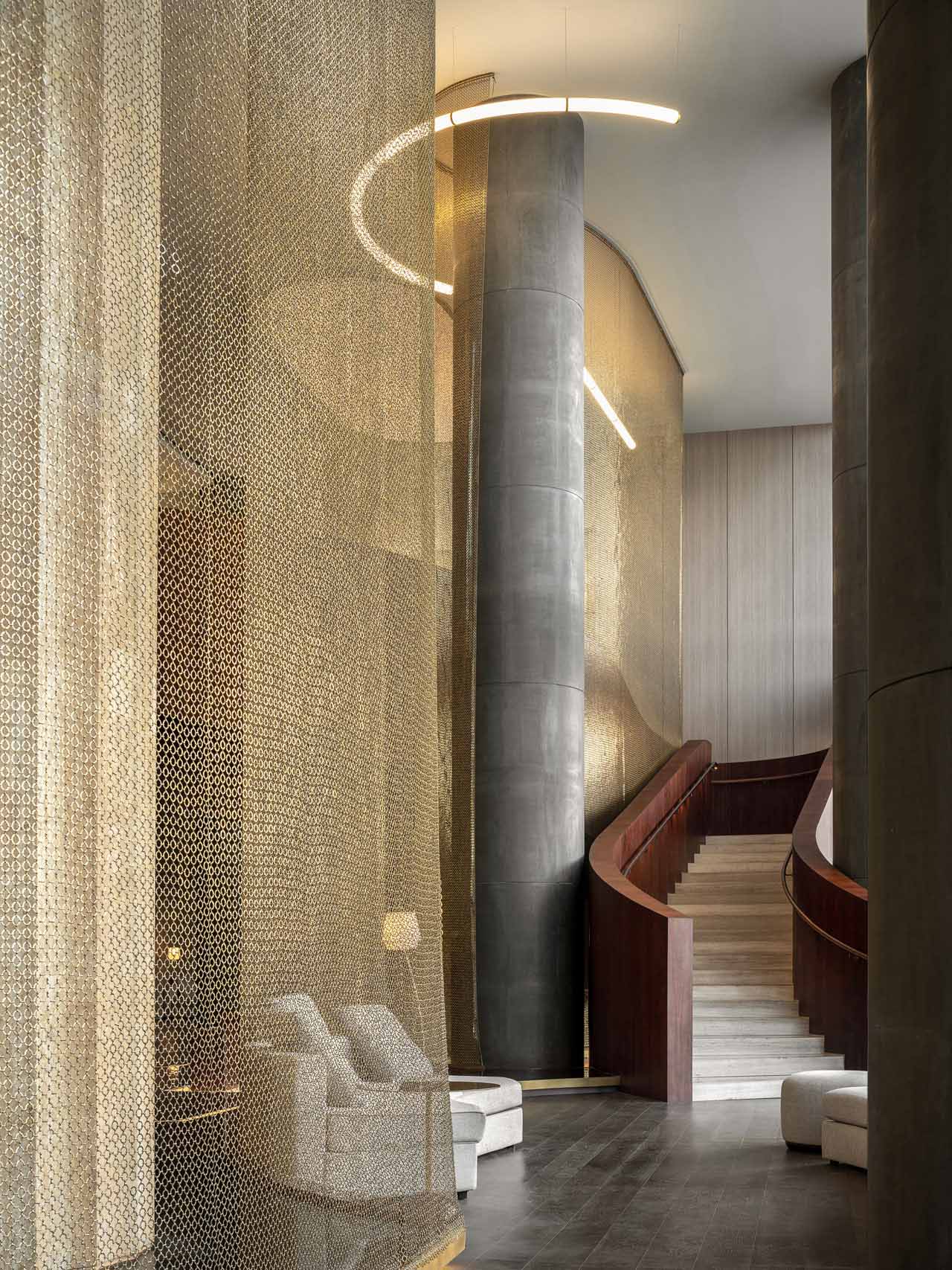
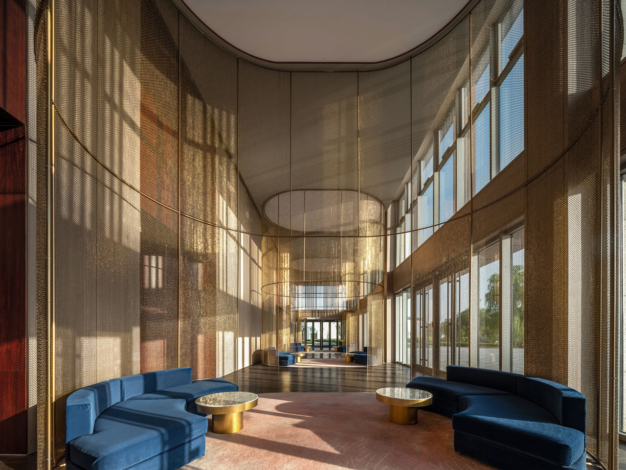
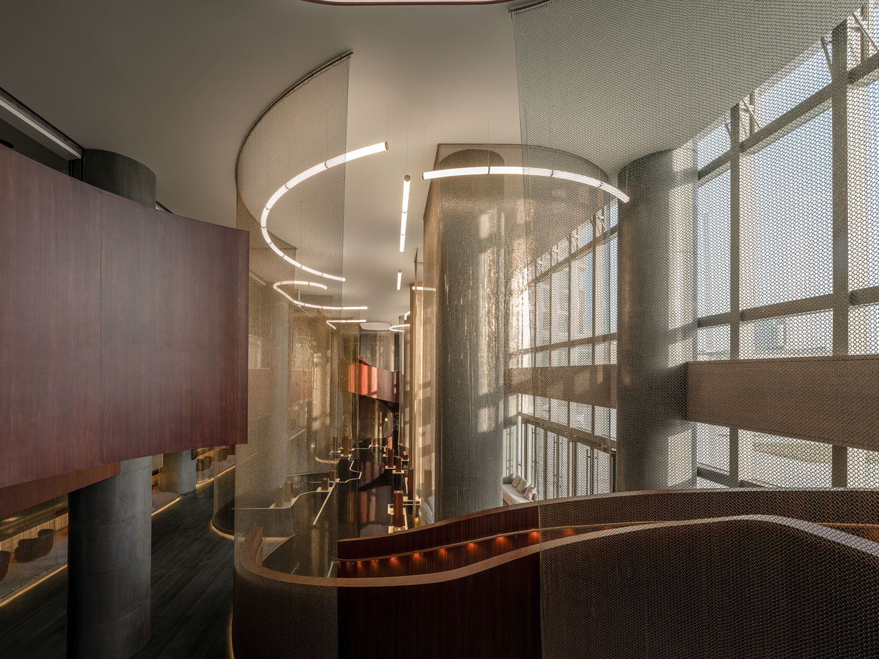
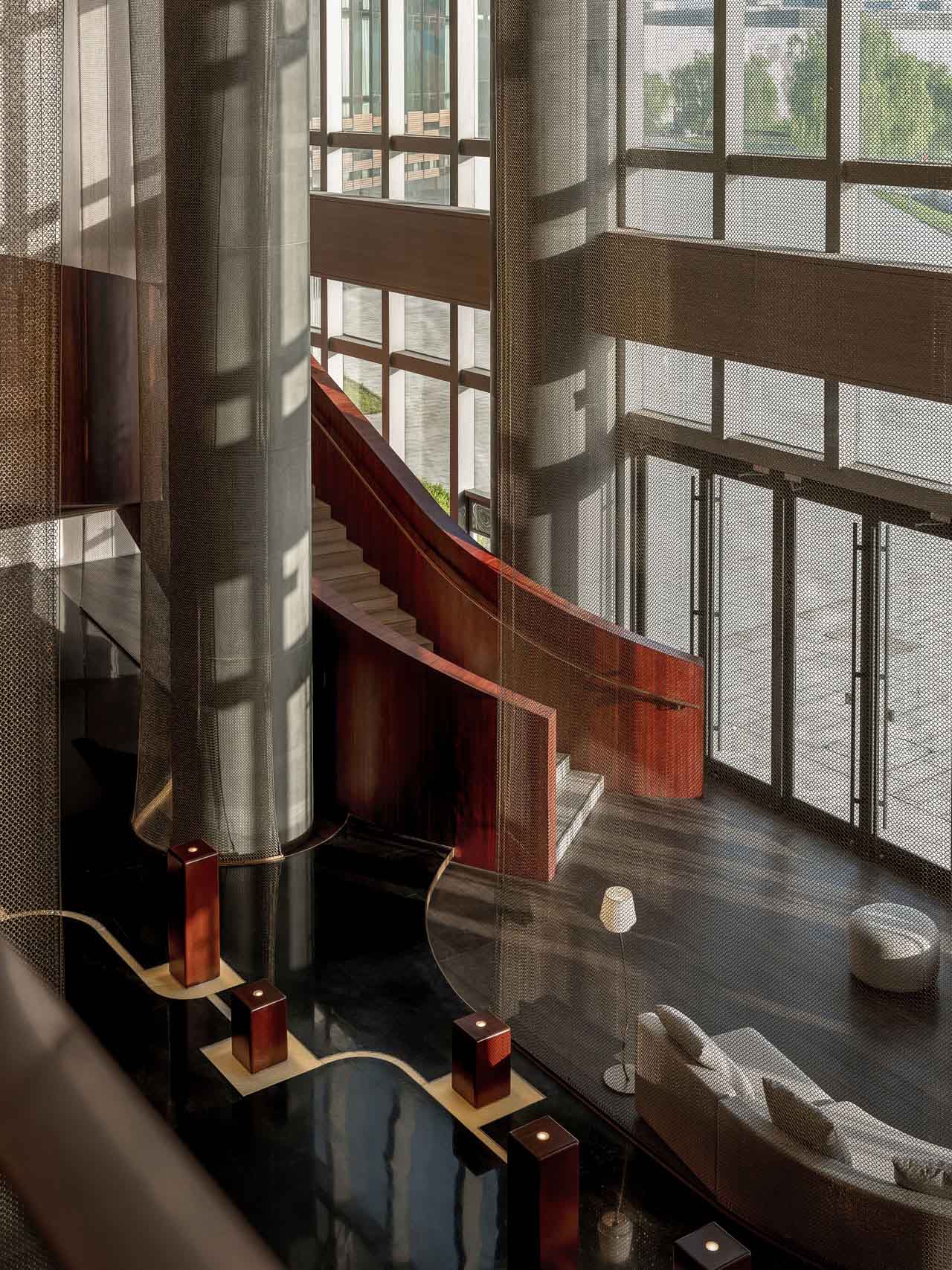
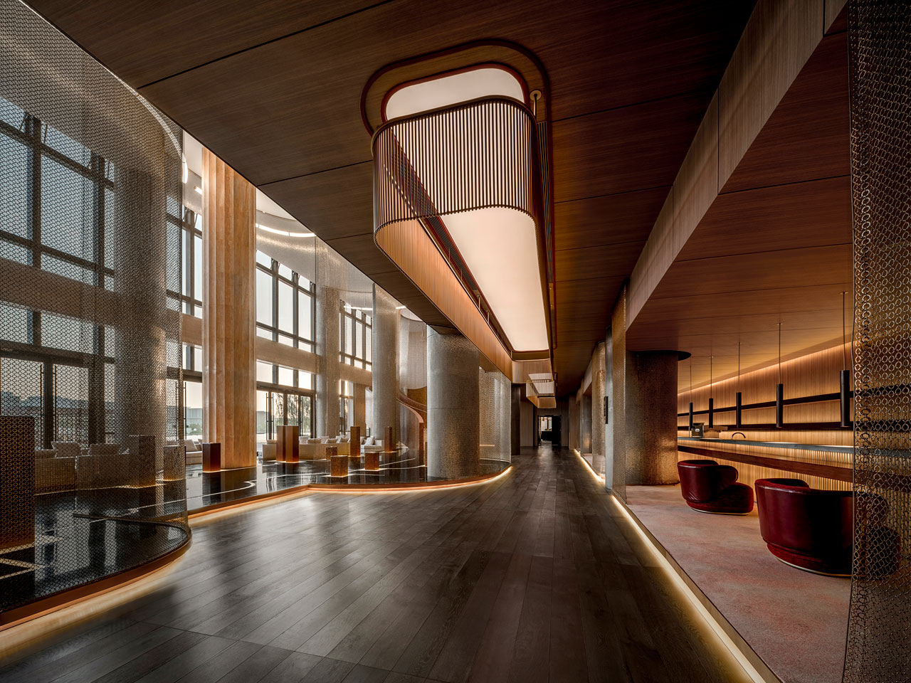
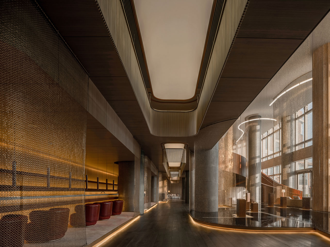
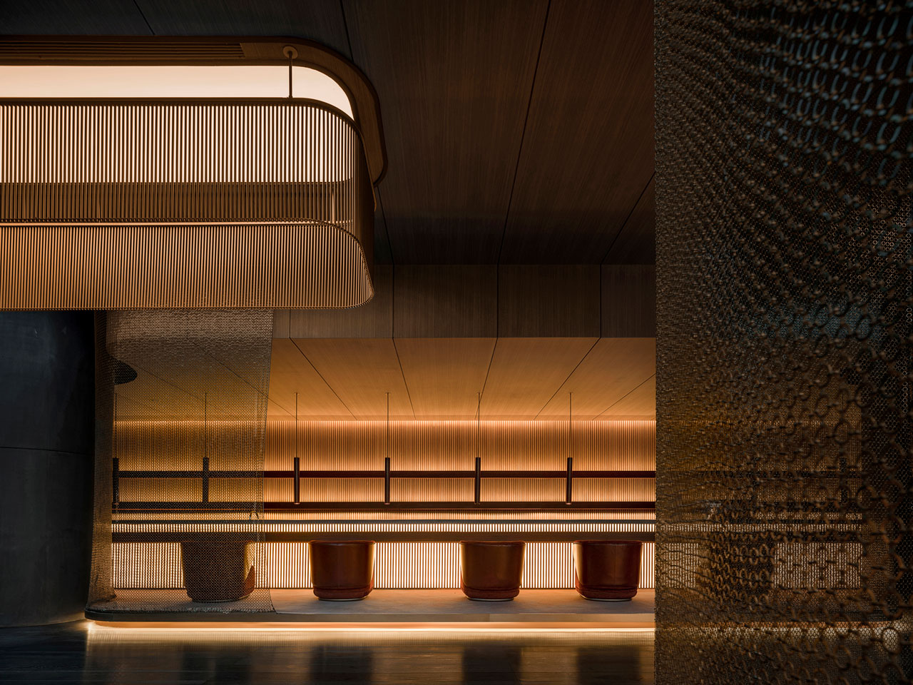
- Exhibition and Bar: Accessed by descending via two freeform staircases weaved between hung curved mesh screens. Exhibits are presented on plinths on a raised platform. The screens act as a veil which curate the exhibit while also providing niches for guests to sit. Each screen a hung gold linked mesh transmits either a static weightless presence or in strong sun floods the volume in a golden shimmering dappled light. A backlit bar stretches 18m with a sunken floor level for Bar staff and a raised platform for guests which helps staff engage comfortably within the customers eye level while serving. Either side are private niches for groups to gather.
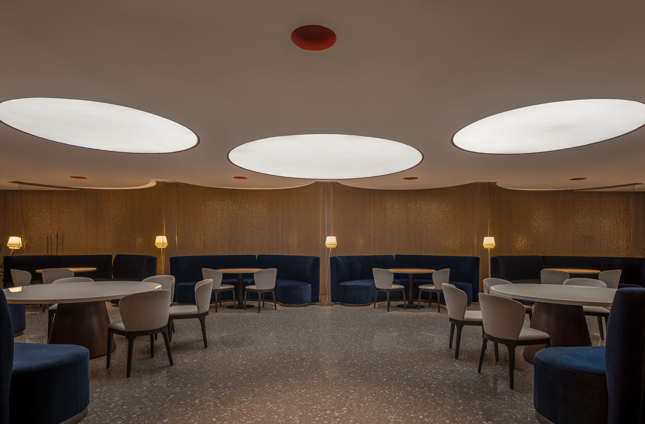
- Restaurant and private dinning: Provide services using an open plan area with islands providing buffet stations. The deep plan allows the dishes to be displayed but also. Private dining can be experienced in separate Curved rooms encased with red brick partitions accommodating 12 persons with private Bathroom and amenities and service zones for catering staff.
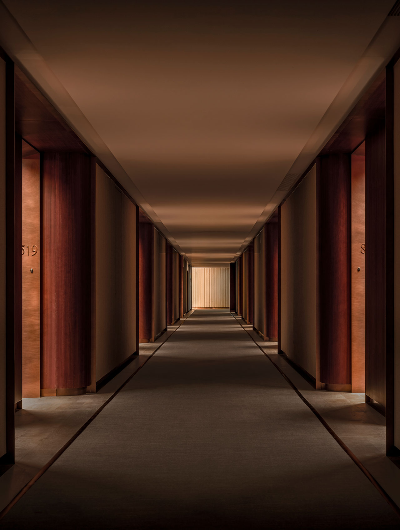
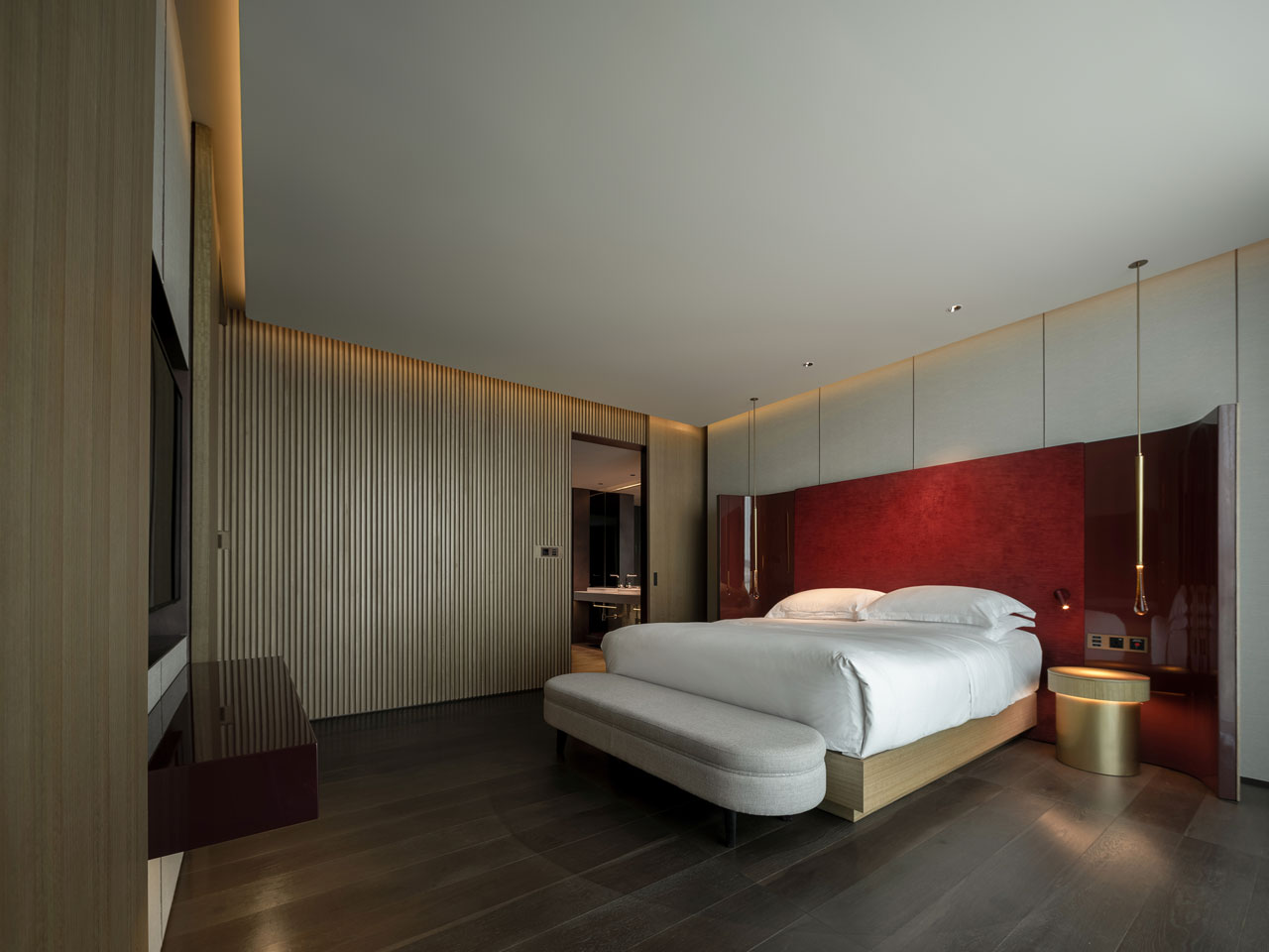
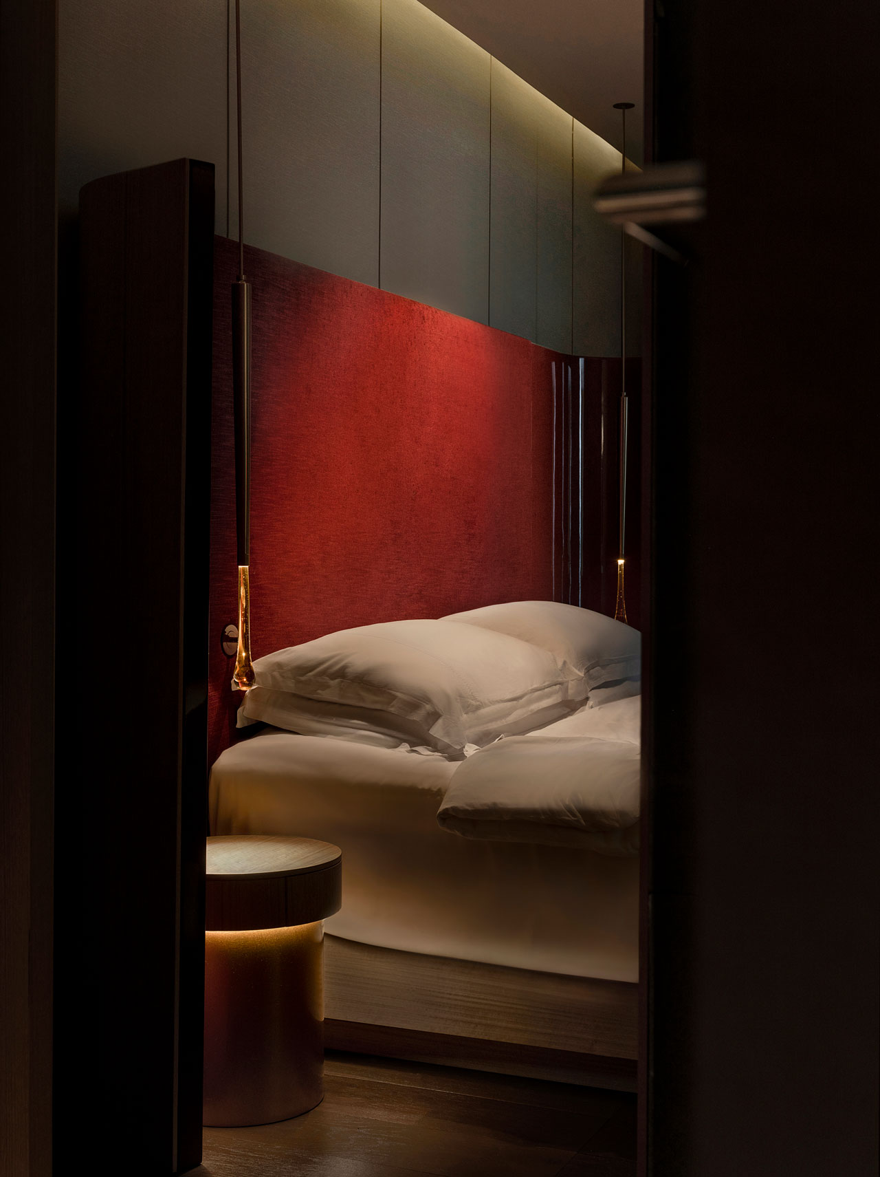
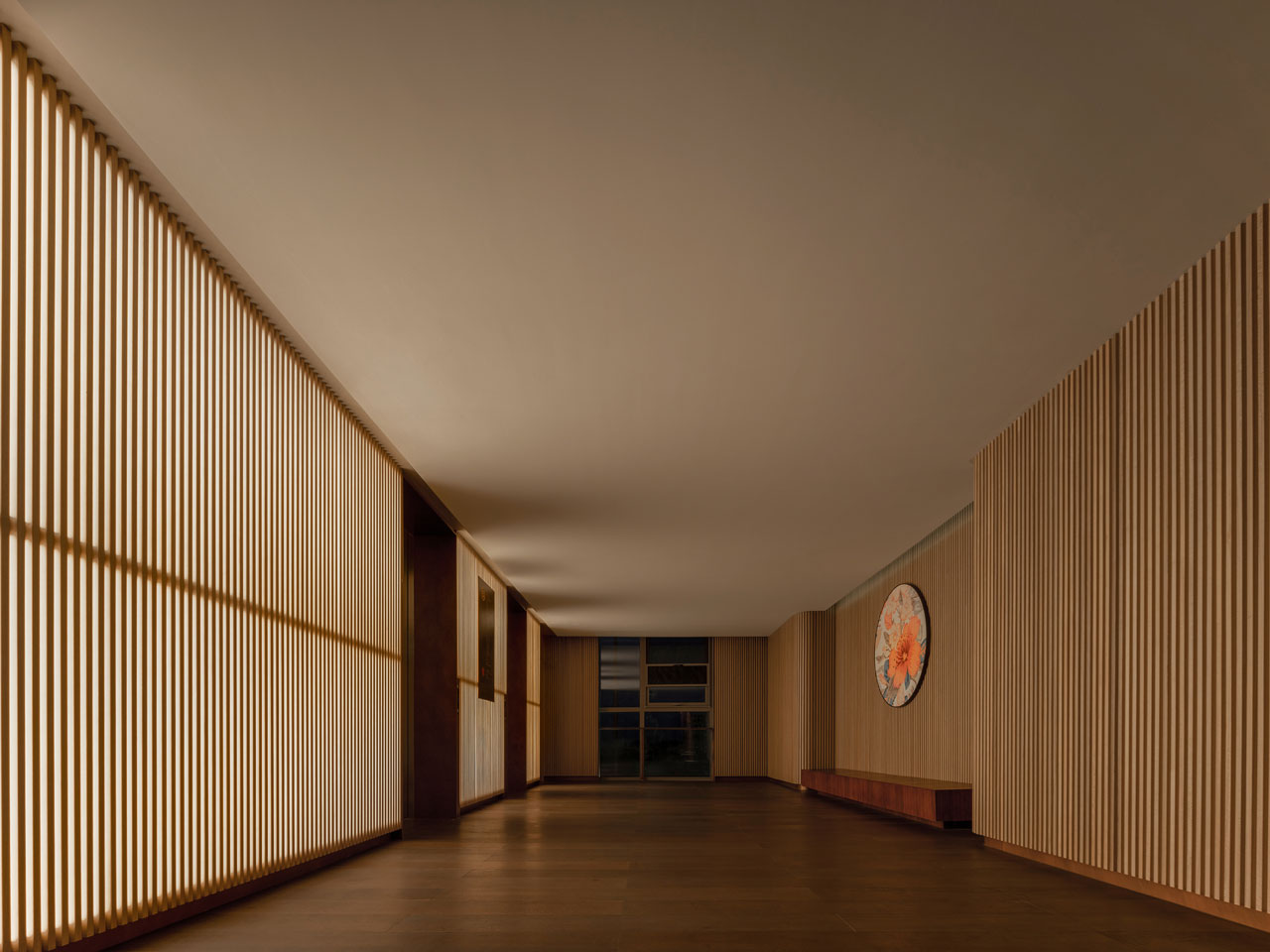
- Room and Suites: Throughout the journey to the room’s effort was taken in the lighting intensity to program an atmosphere for stillness and calming environment. Each room door is illuminated by a single light embedded in the alcove entrance for way finding. Internally they are bright and airy intentionally toned down with richer colors from the public areas used as highlights in the headboard, Door and light fixtures. The Ensuite Is more intimate with attention to only light areas of activity such a bath and make up table. Low level alcove lighting Illuminated the floor space for night guides. To soften the atmosphere Two feature walls where added. The bathroom wall was rippled using concave granite strips complimenting the low level lighting charcoal glass for shower room. In the room lobby a curved wall is constructed from wooden batons. Attention was given to conceal all built in room furniture and amenities such as wardrobe, minibar and bathroom door.
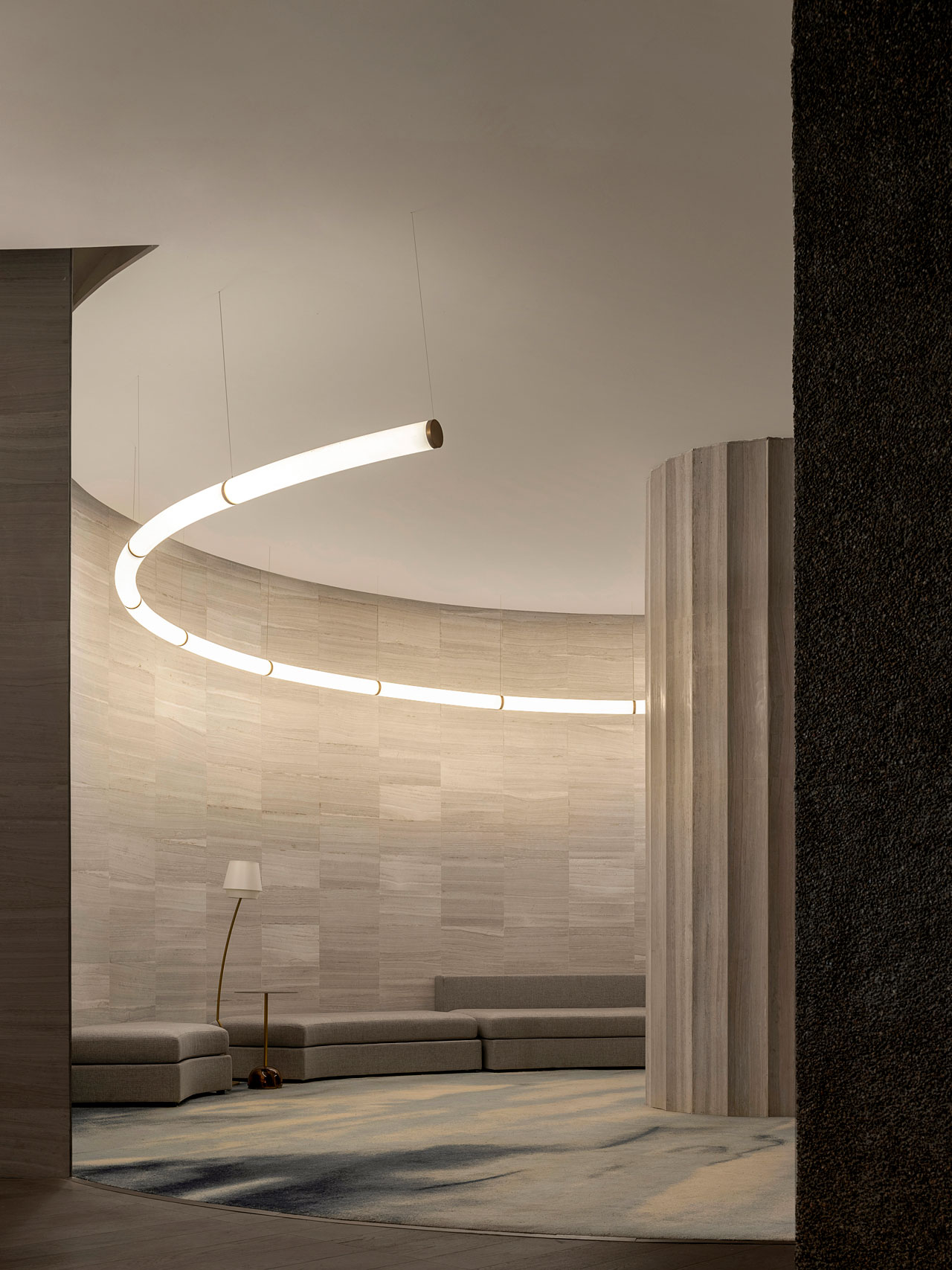
- Banquet and Ballroom: Built as a Multifunction space for Erjiao’s corporate events and also for celebrations such as Weddings. A pre-function space as alcoves defined by hung mesh within which is softer with carpet and seating. Doors to the ballroom are red beacons which continue inside joined together by a rippling plan profiled wall. Three huge chandeliers hang from the ceiling reducing the volume in height in portions while still grand creating a smaller comfort in scale for guest unusual for a room which holds up to 300 people
- Spa and Wellness Studio: The spa uses excessive aggregate and rough finishes as a continuous floor finish and Curved walls. Throughout the consultation spaces doctor’s rooms are semi open using screens and opaque colour pigments to give privacy. Public spa facilities are supplemented by a number of private rooms all follow the hotel colour scheme.
Wrap up
Just like our bodies there is no straight or hard corners and the perfect angle is in the eye of the beholder. We feel the perception of space through our bodies and this imparts an emotional response. We use curves and Arc’s to as we believe It is the most comfortable geometry to experience space. Through moving your body we will balance itself based on sensory information, it is this rich experience is the inner state that Erjiao hopes to bring to people.
