


Erdos Land – The Land is PLAYFUL, 2024 - 2025 Read more {{currentSlide}}/{{total}}
Erdos Land – The Land is PLAYFUL
Narrative
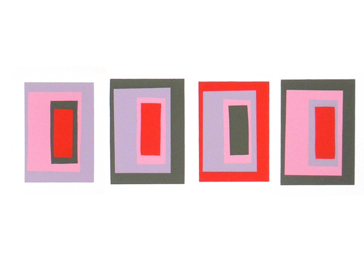
“Color deceives continually” Joseph Albers.
Playful devices have been used throughout the design to enhance the shopping experience. Colour has been utilized as a form of other worldliness and escapism. Referencing Joseph Albers ‘Interaction of Colour’
“Colour is never seen as it is. Its appearances altered by adjacent Colours. You can shift the emotional temperature of a neutral or fixed color simply by changing the surround, without altering the actual pigment.” “Designers and artists can control emotional tone by manipulating surrounding colors rather than altering the target color.” – Joseph Albers.
Mood Implications
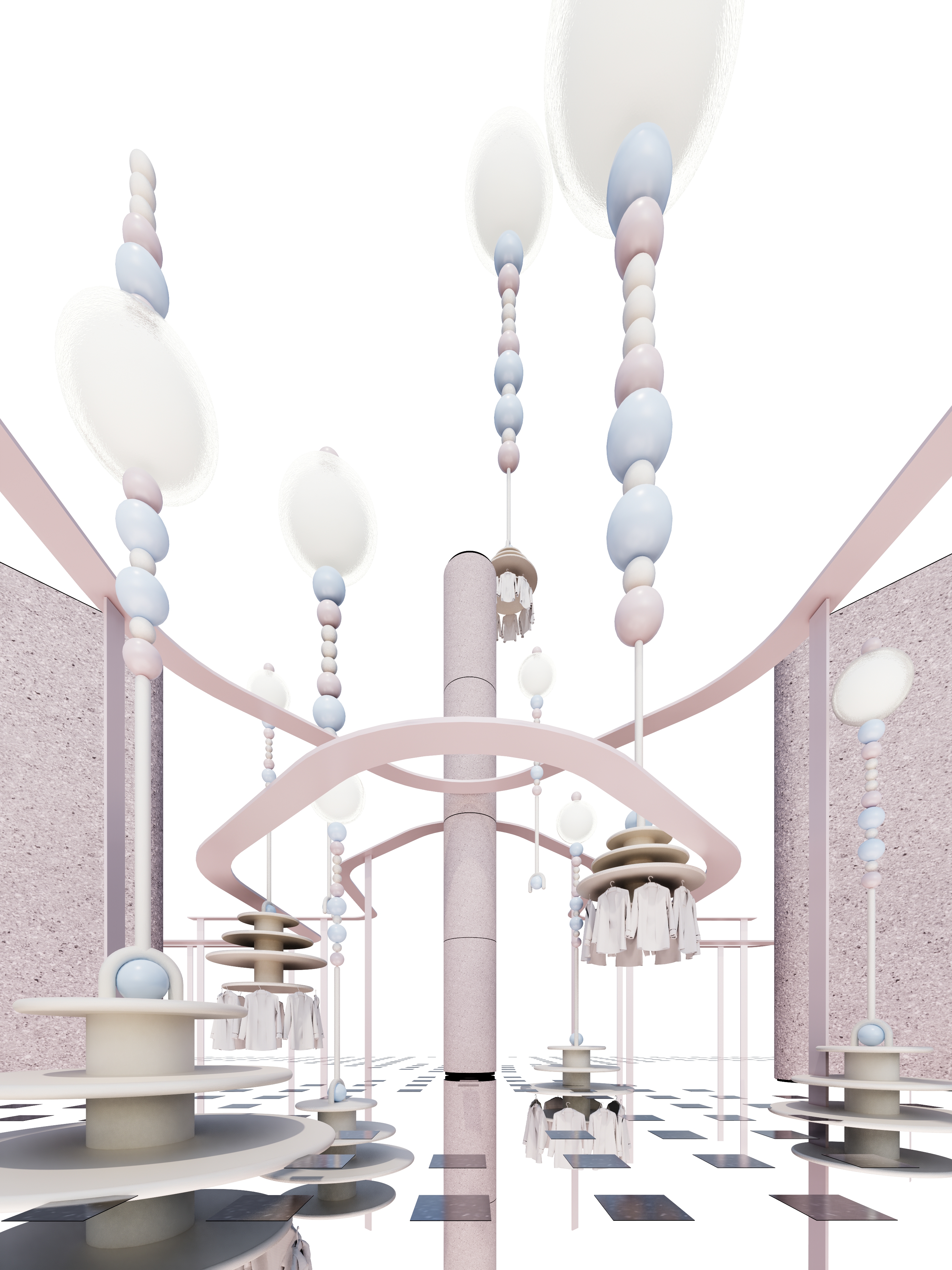
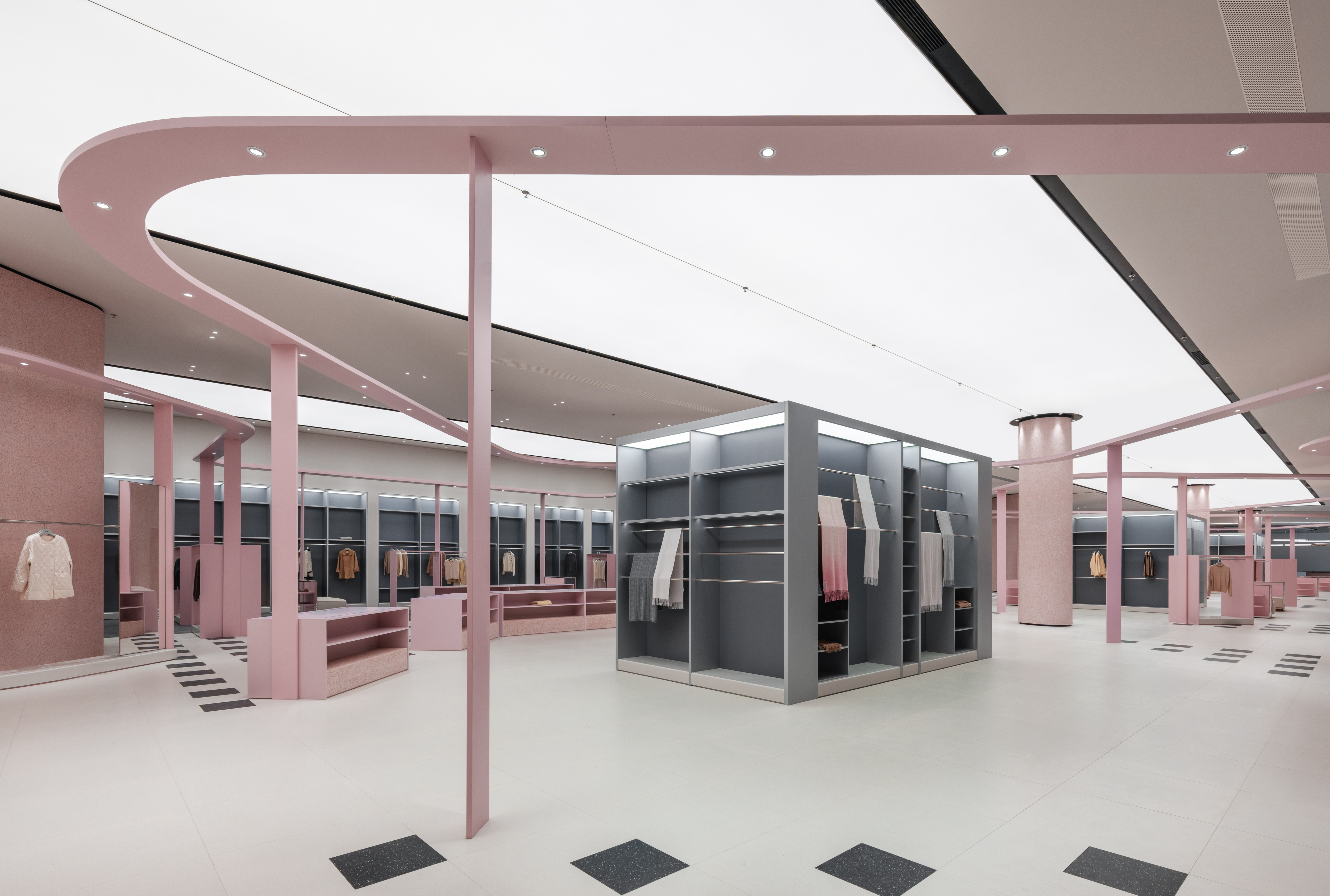
Pink surrounds soften the perceived mood, with frames in these tones creating optical vibrations that lend a lighter, more playful quality. Colors were chosen specifically to convey joy and happiness. This effect is achieved through emphasis on highlight tones, while allowing mixtures of color combinations that keep garments as the target. A Tall continuous pink, pigmented, ribbon-like rack acts as the central device. It supports the task lighting for booths, provides wayfinding to guide visitors’ engagement through the shop, and frames as well as controls the inevitable high quantity and scale of items to be displayed in this factory store.
General Description of Program
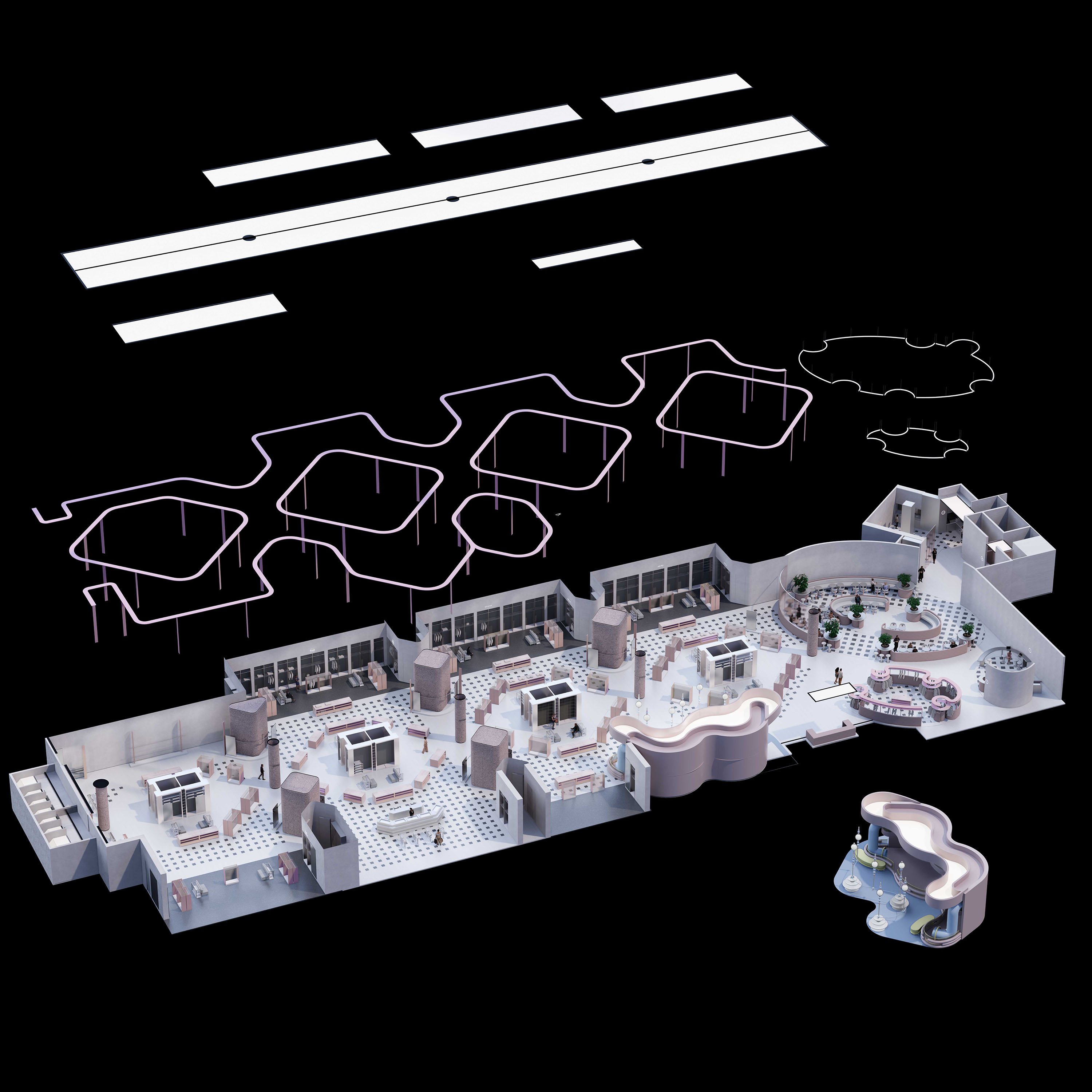
ERDOS Land is a luxury outlet positioned within the company’s new facility, located inside the headquarters complex on the periphery of Ordos city within the autonomous region. The new facilities comprise of 2,600 sqm of shopping space that brings together all of the company’s brands, supported by an additional 700 sqm of functions including a children’s play area, a café, and a tourist center.
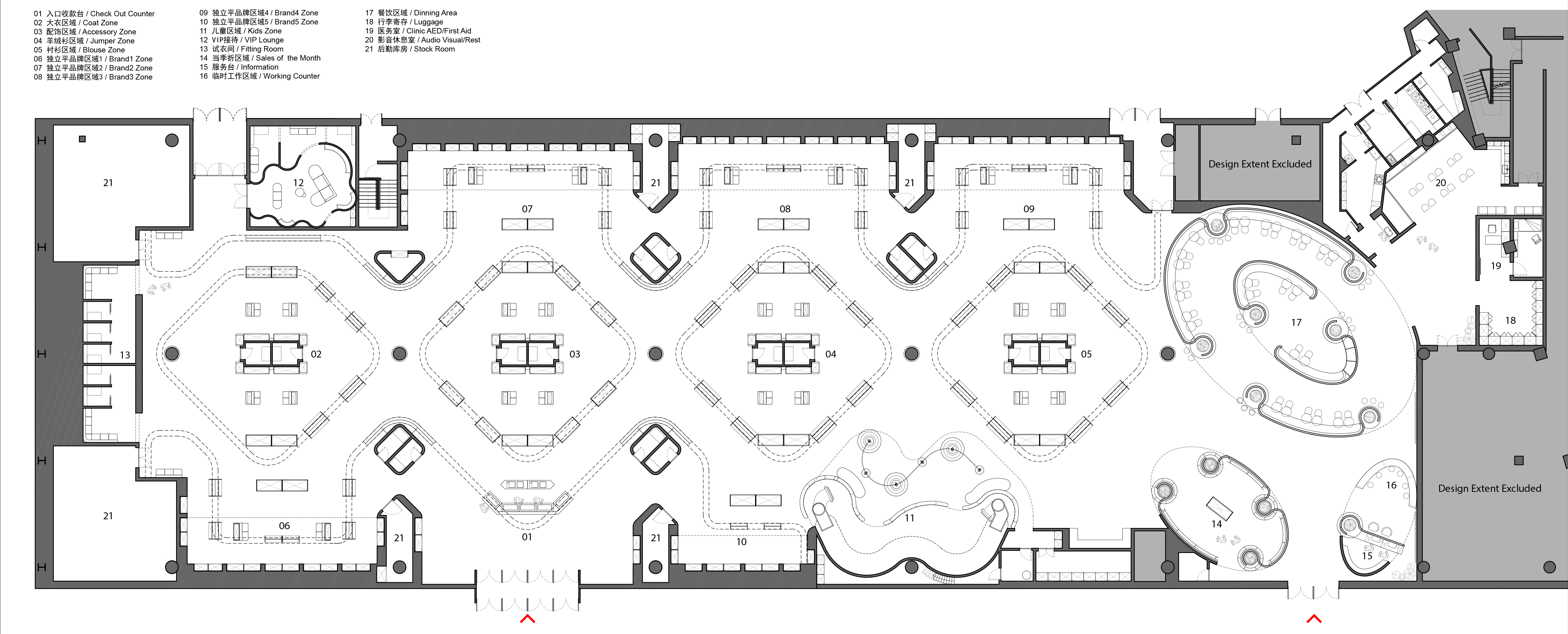
As the brand’s largest single-floor shop, the store is expected to accommodate more than 700 visitors per day during peak seasons, while displaying over 4,000 items across five brand labels. Circulation is therefore central to its success, with the floor plan organized around four central islands that allow the act of shopping to be experienced as either a continuous loop or through interconnected figure-of-eight clusters. Along the perimeter, opposite booths house the different brand labels, each island focusing on a distinct garment type—scarves, jumpers, accessories, and general wear. Aggregate pillars separating the booths incorporate fitting rooms, while one alcove dedicated to the children’s range integrates play facilities directly into the retail environment. Complementing the task lighting, the entire shop is unified beneath an uninterrupted barrisol ceiling, its seamless surface enhancing and controlling light levels suitable for retail, reducing harsh shadows and adding softness to the clothes display to create an open and positive.
Customization – Play and Architecture Cross-Over
A children’s booth incorporates play amenities within the clothing displays, adapting and exaggerating elements from the wider store. Feature chandeliers are integrated into the displays, doubling as supports for garment rails. A contorted “barrisol” ceiling with a fluid form contrasts with the simple rhythmic geometry of the store’s lighting and color range. Pipes acting as climbing structures and ensure the scheme remains both visually and physically playful.
Playful devices appear consistently throughout the project to enhance the shopping experience. From applications of colour compositions under the guidance that “colour can deceive continually” Display arrangements employed in circulation routes and planning arrangement. To more directly incorporating a play devices directly for children ensuring in this project architecture supports both commerce without negatively impacting experience.