Gallery Living, Interior, 2016 - 2019 Read more {{currentSlide}}/{{total}}
Home Temperature
Short Project Submission
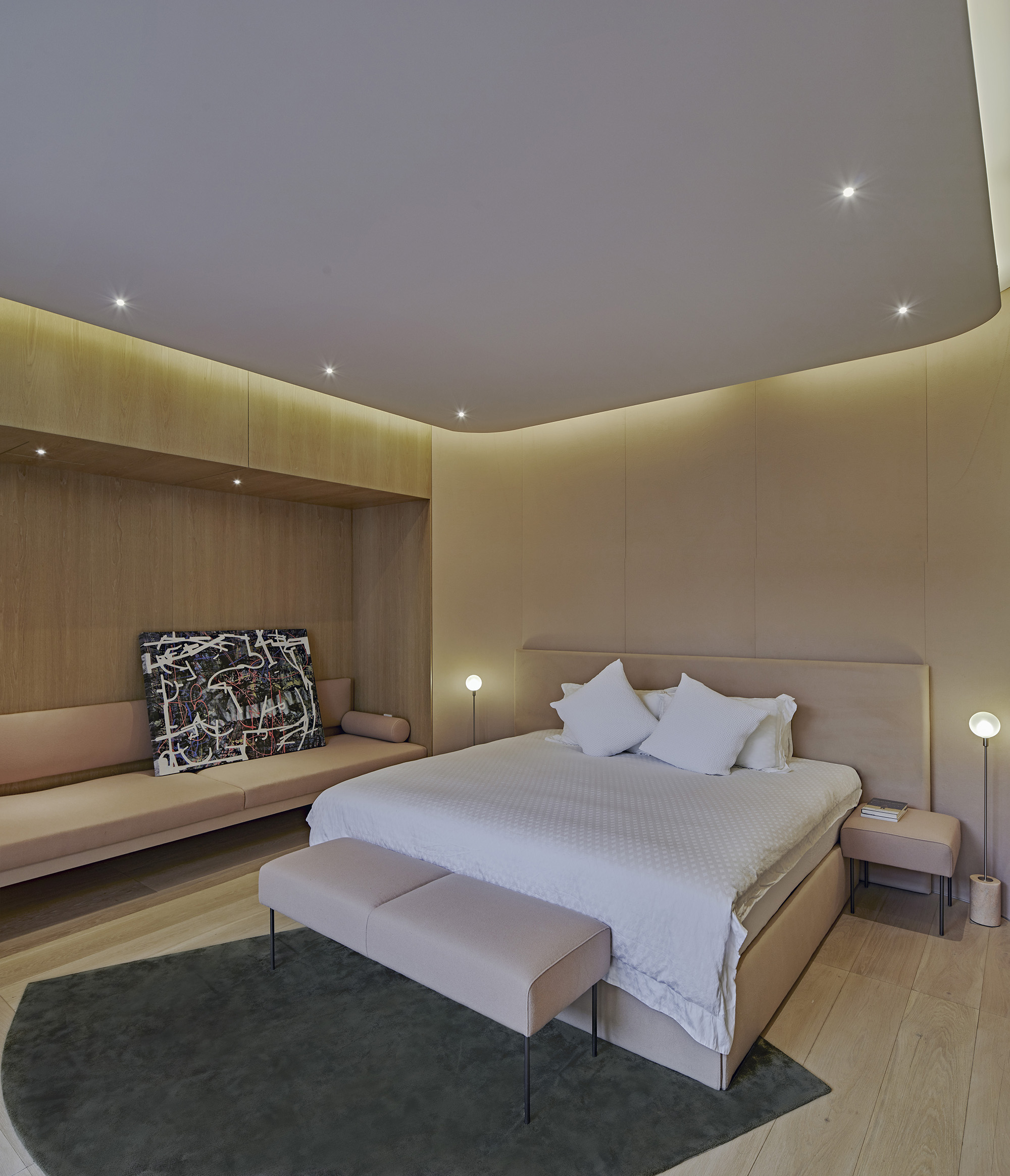
What is the temperature of a home? Shaping of space should be an emotional experience. By measuring this temperature and its effects on mood, can a unit of emotion be derived to positively impact design has on living-spaces? The home is a place we spend the majority of our downtime. waa attempted to address how we can make a house a closer fit to identity by provoking emotional responses in the core fabric of the building. By embracing temperatures of colour as a generator for concept, and amplifying these palates of emotion through the projection of light, throughout the home.
Long Project Submission
The Home was our field test of influencing emotional calm states, through manipulation of colour combinations and tonal ranges.
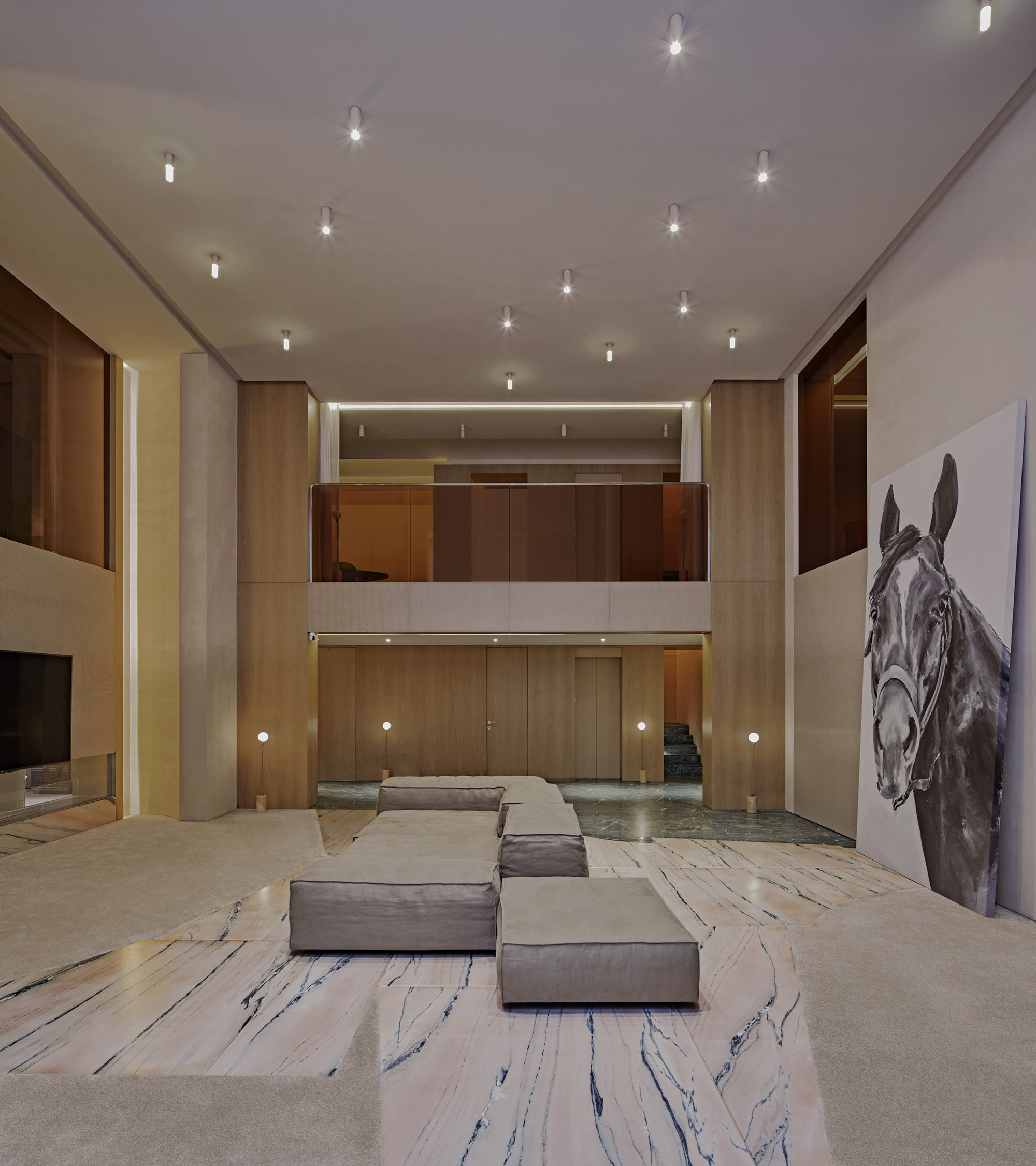
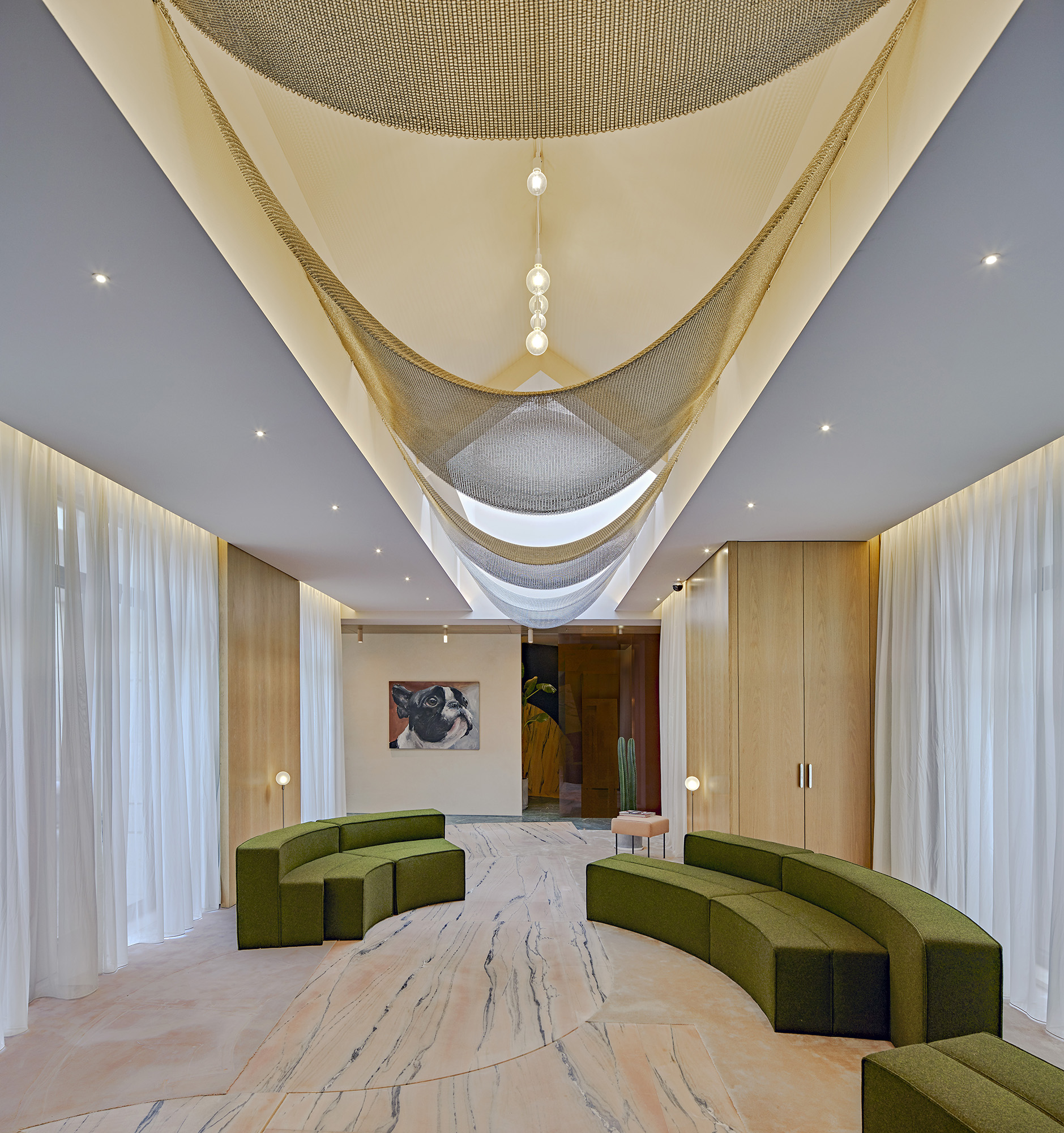
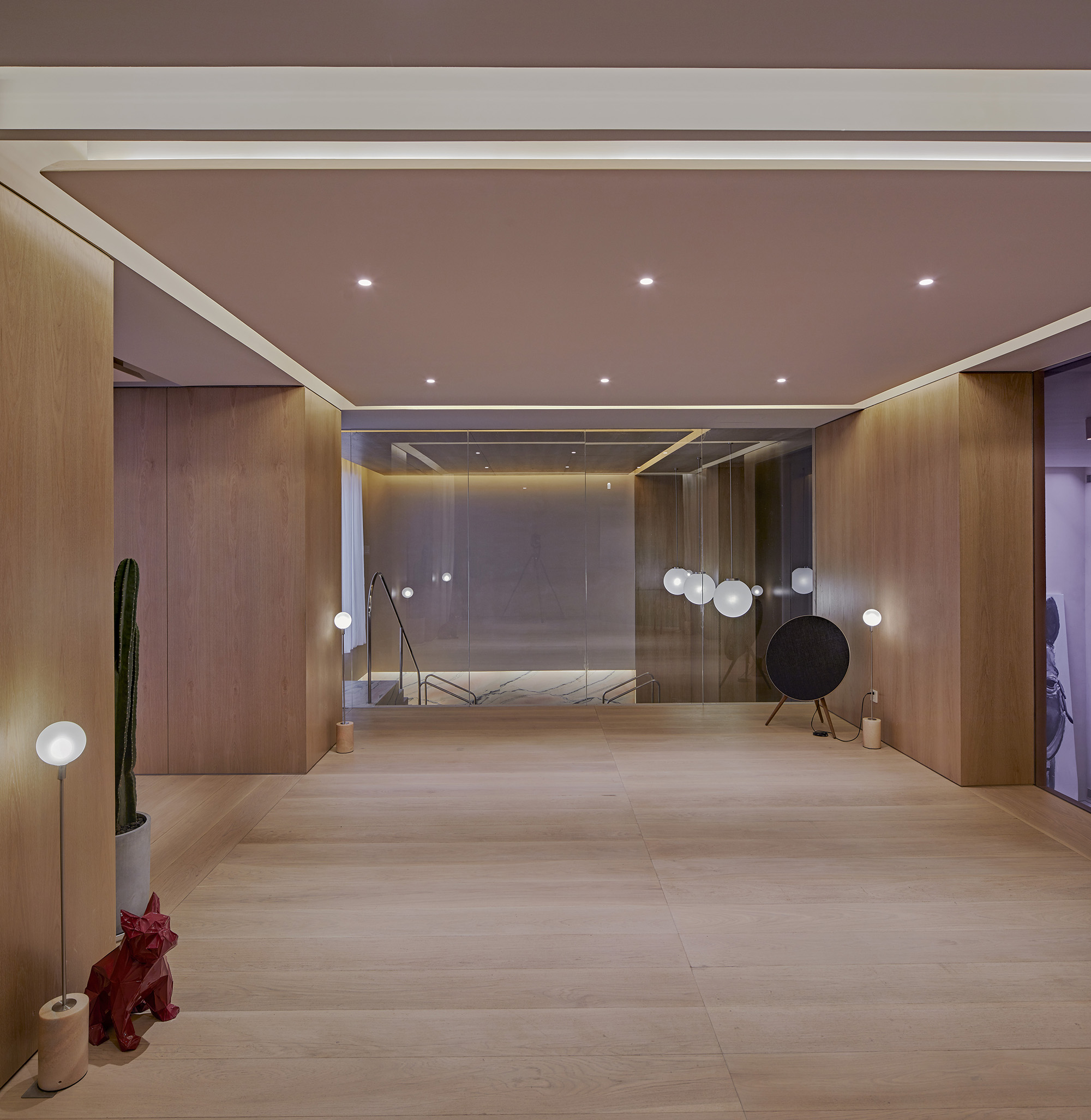
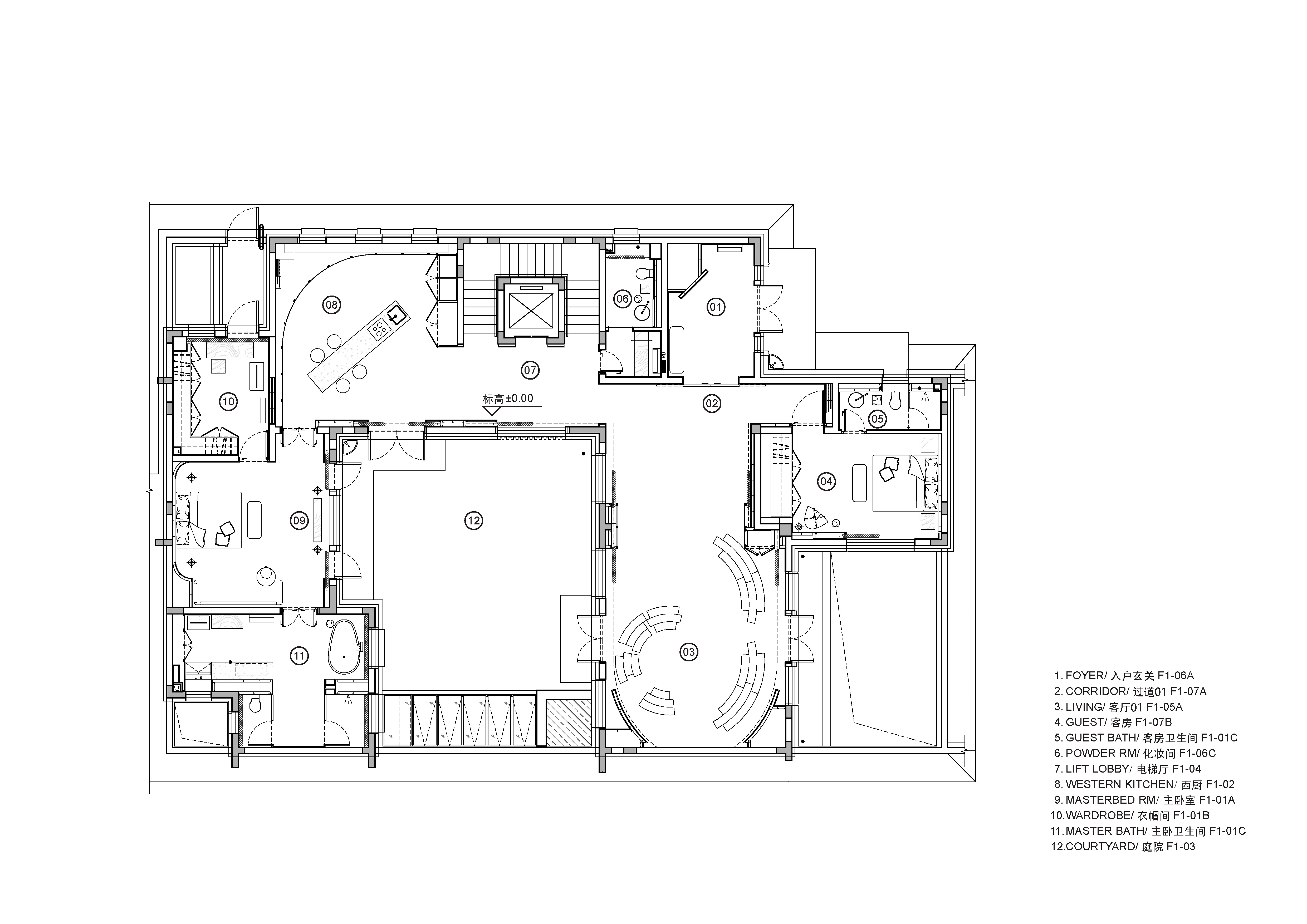
- Half of the 900sqm area of the house was subterranean and designed to a traditional dense room layout. We adjusted the base build structure substantially to facilitate the large volume below ground. Basement level 1 floor was demolished allowing an uninterrupted 8m high volume. A mezzanine floor was rebuilt to create an internal courtyard this Living space acts a circulation route connecting both corners of the plan. To allow natural light to reach the basement a skylight was added in the garden above.
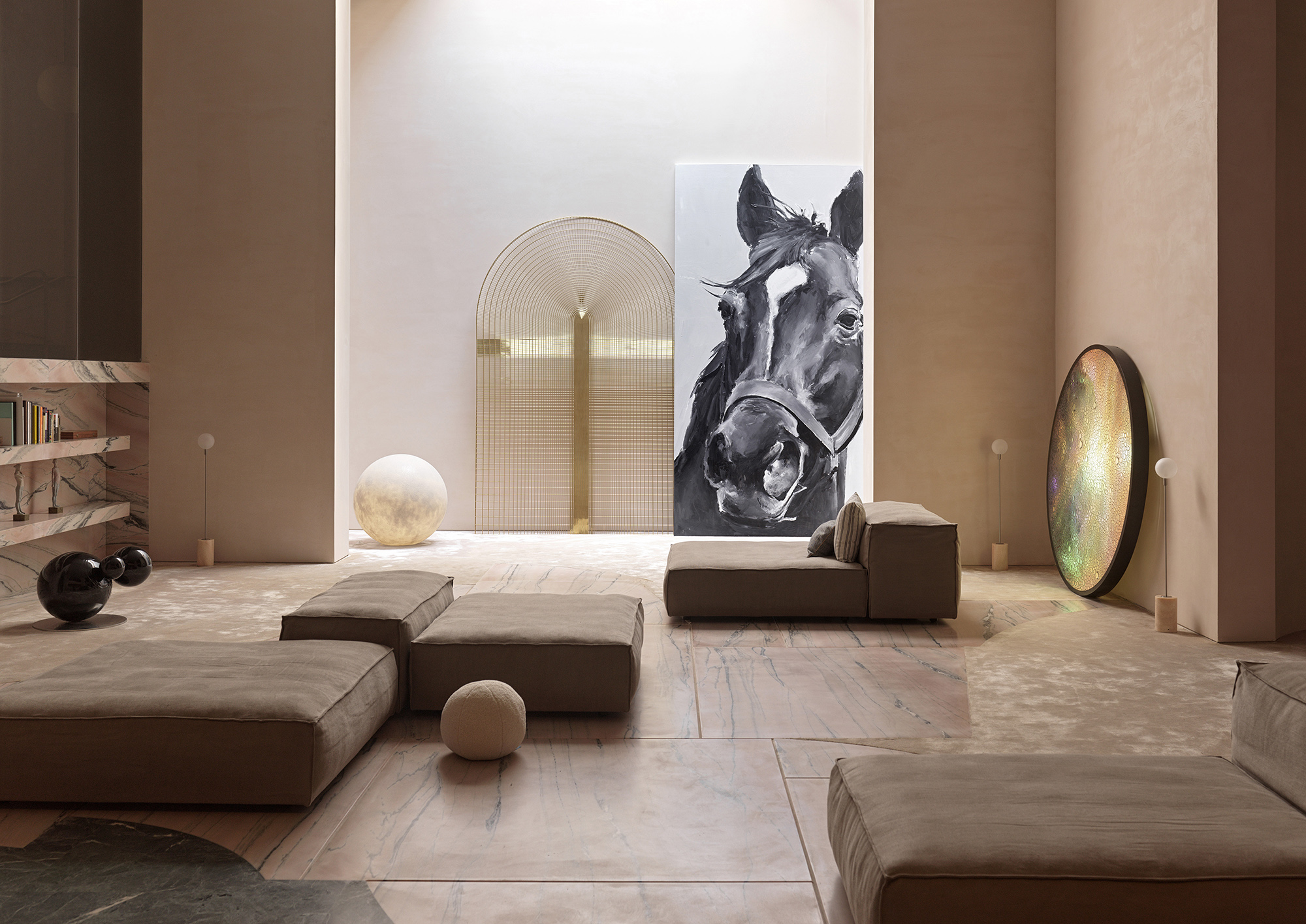
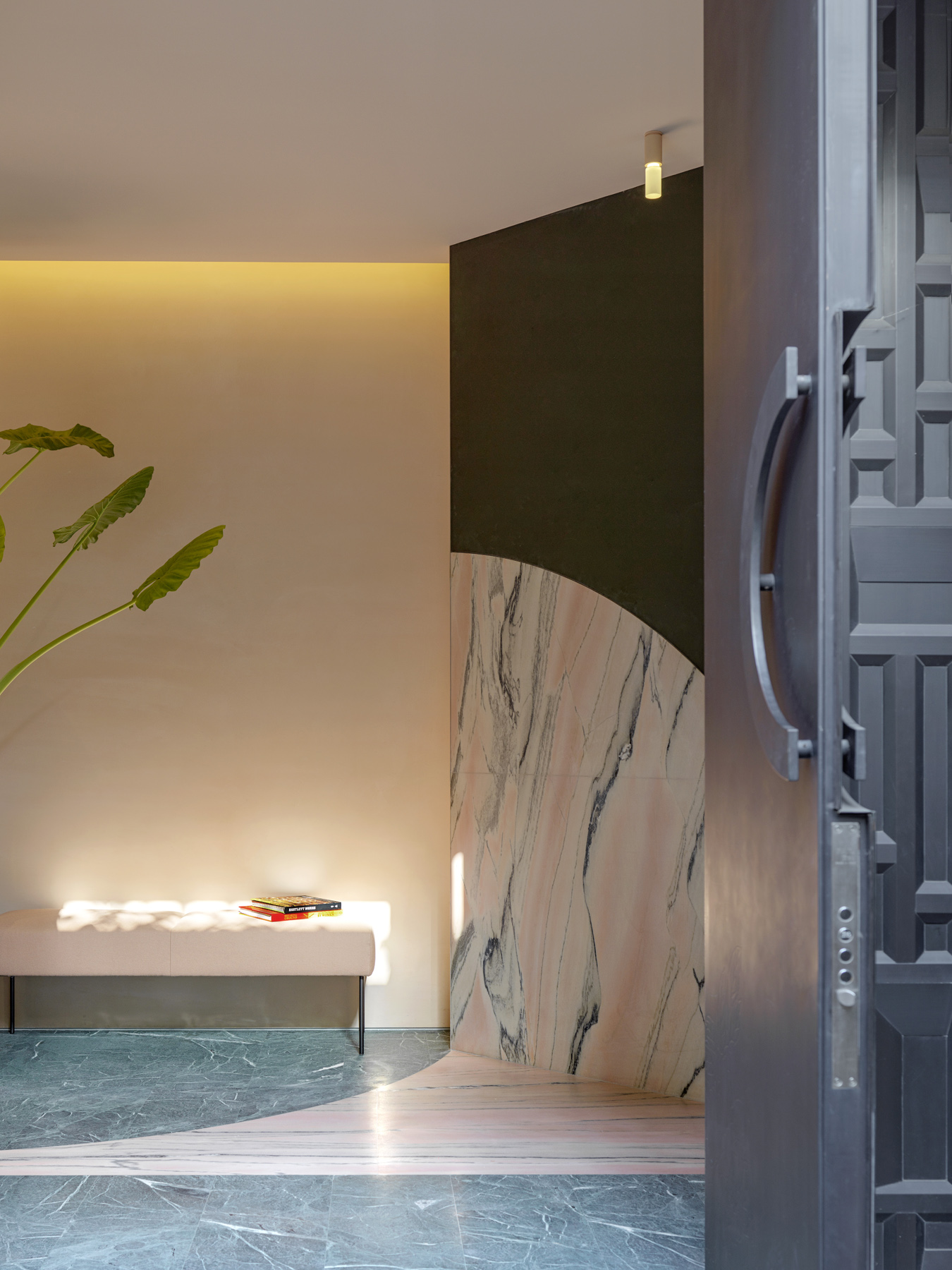
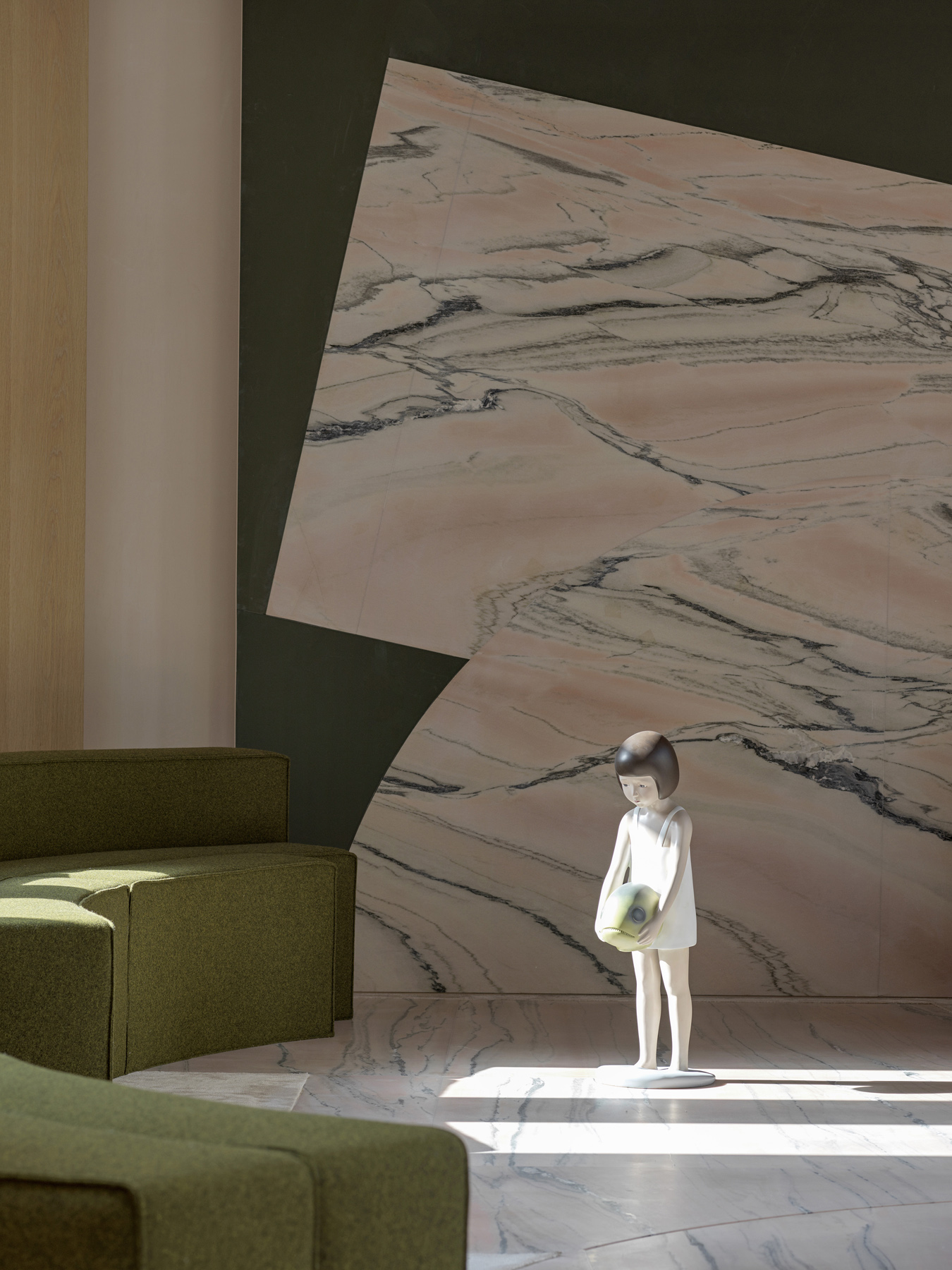
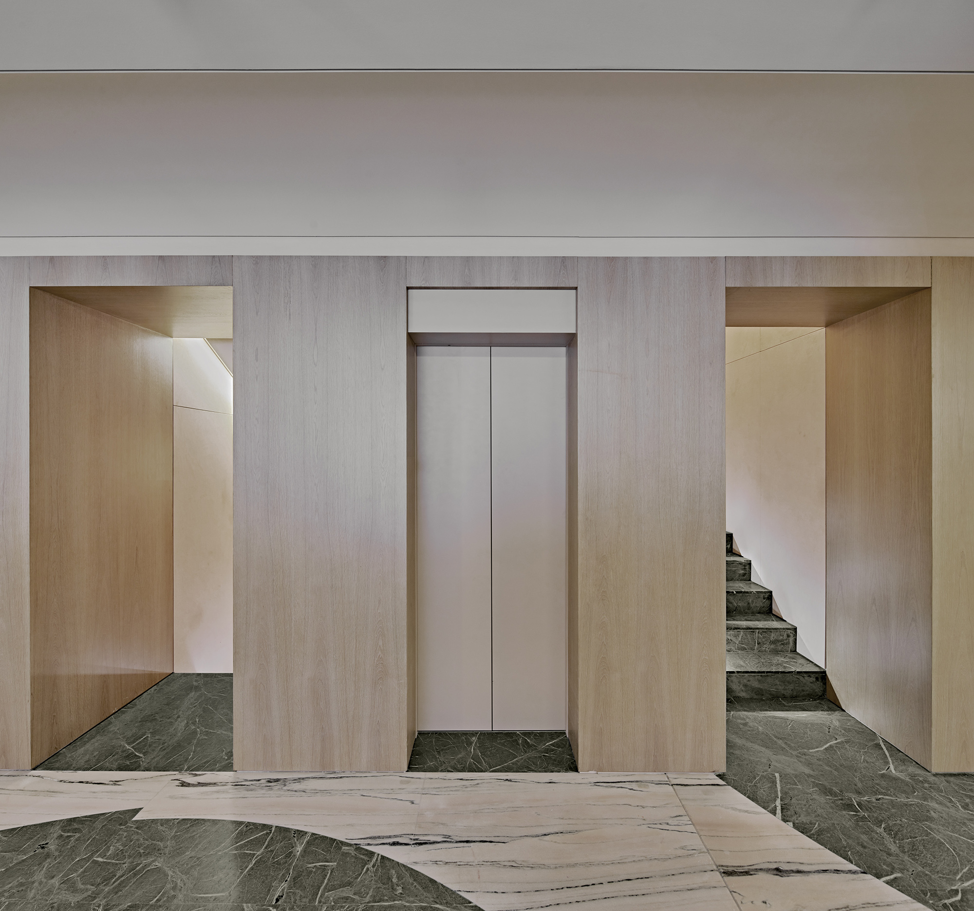
- The story of the House starts with a treasured Painting owned by the home owner. A site visit to quarries to source appropriate offcuts of Italian raw marble ensued. After reviewing proportions and pigments which complimented the painting a boulder was selected to be the key Stone.
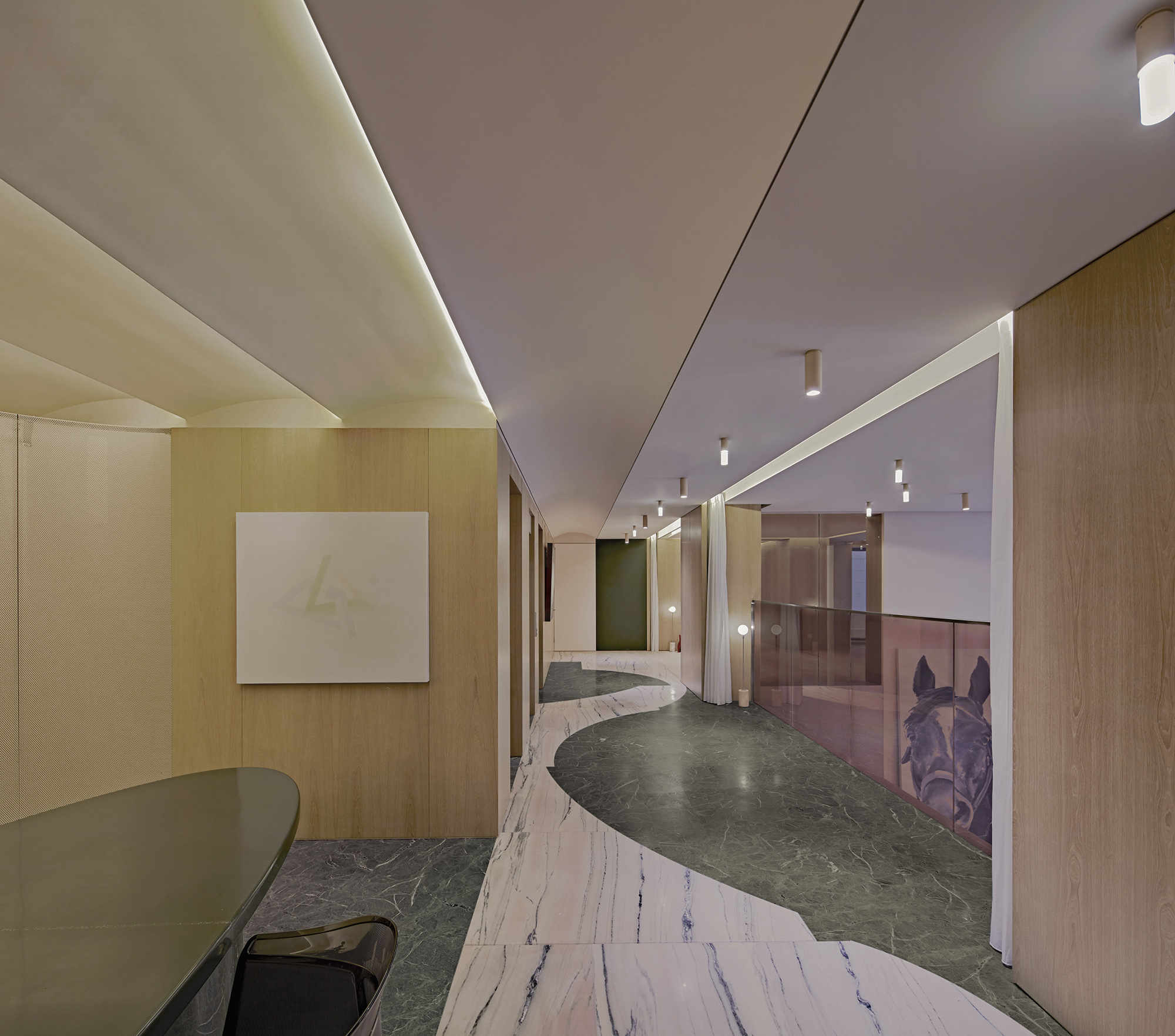
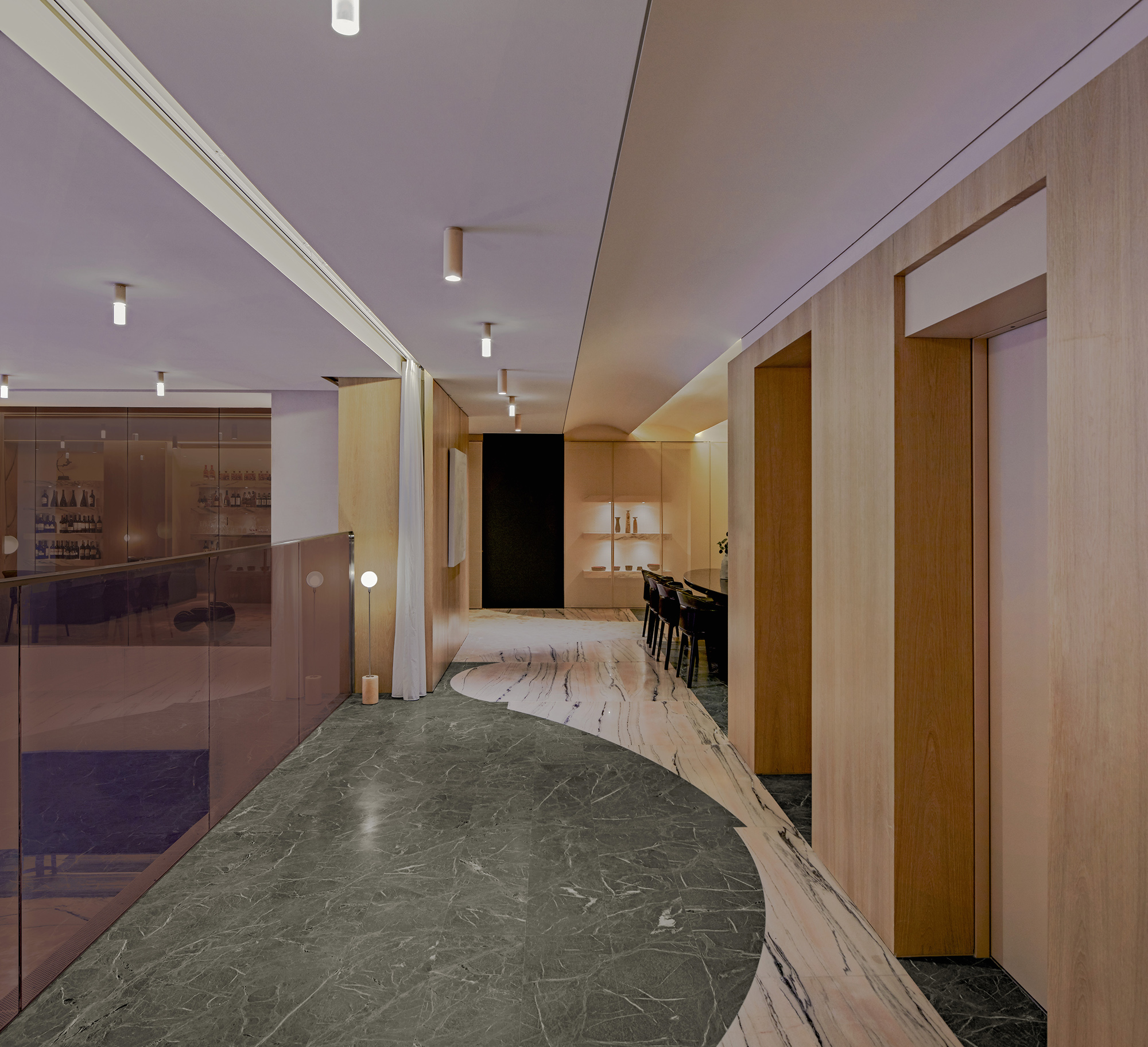
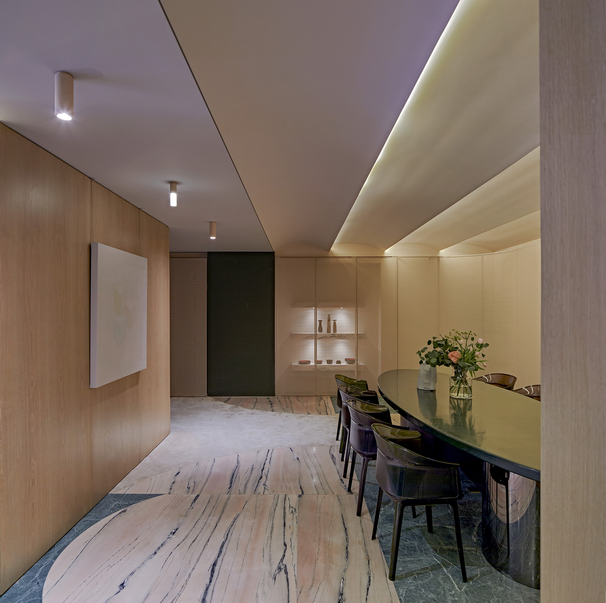
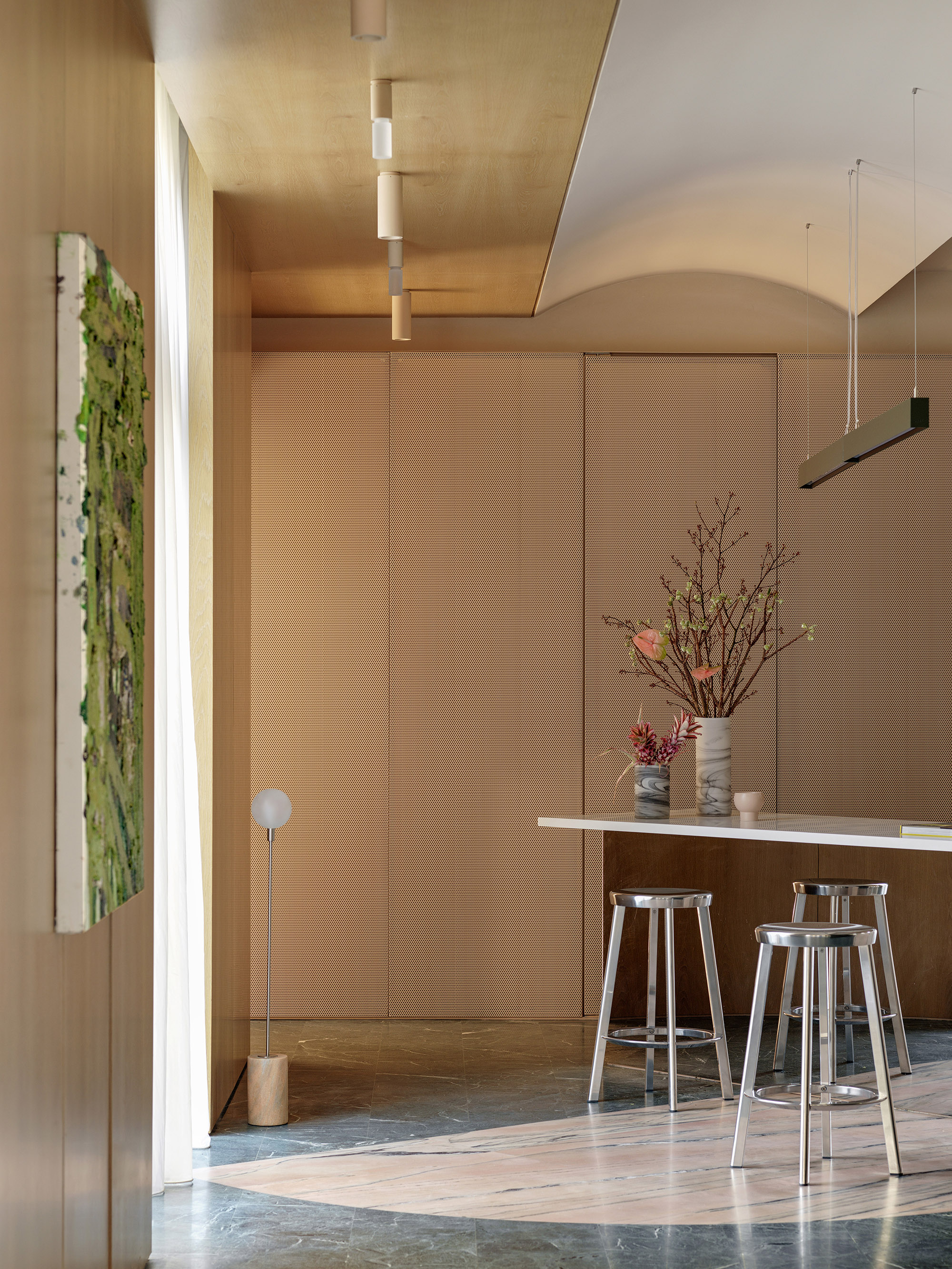
- The key stone encompasses three shades of pink, gray, and dark green, each panel was cut to a maximum of 2m x2.5m slices. The slices according to its shape suggested different arcs to be sprung. These where arranged being careful to line up the natural grain between panels. They were arranged in an Ad-hoc manor into each zone of the home symbolizing the activity of each social activity. It must be stated that minimizing of material drove the shape arrangement.
- After the Stone spatial guides are placed on floors to indicate and define activity, there are opportunities to remove other boundary devices such as doors and walls to open up and move away from the original traditional plan.
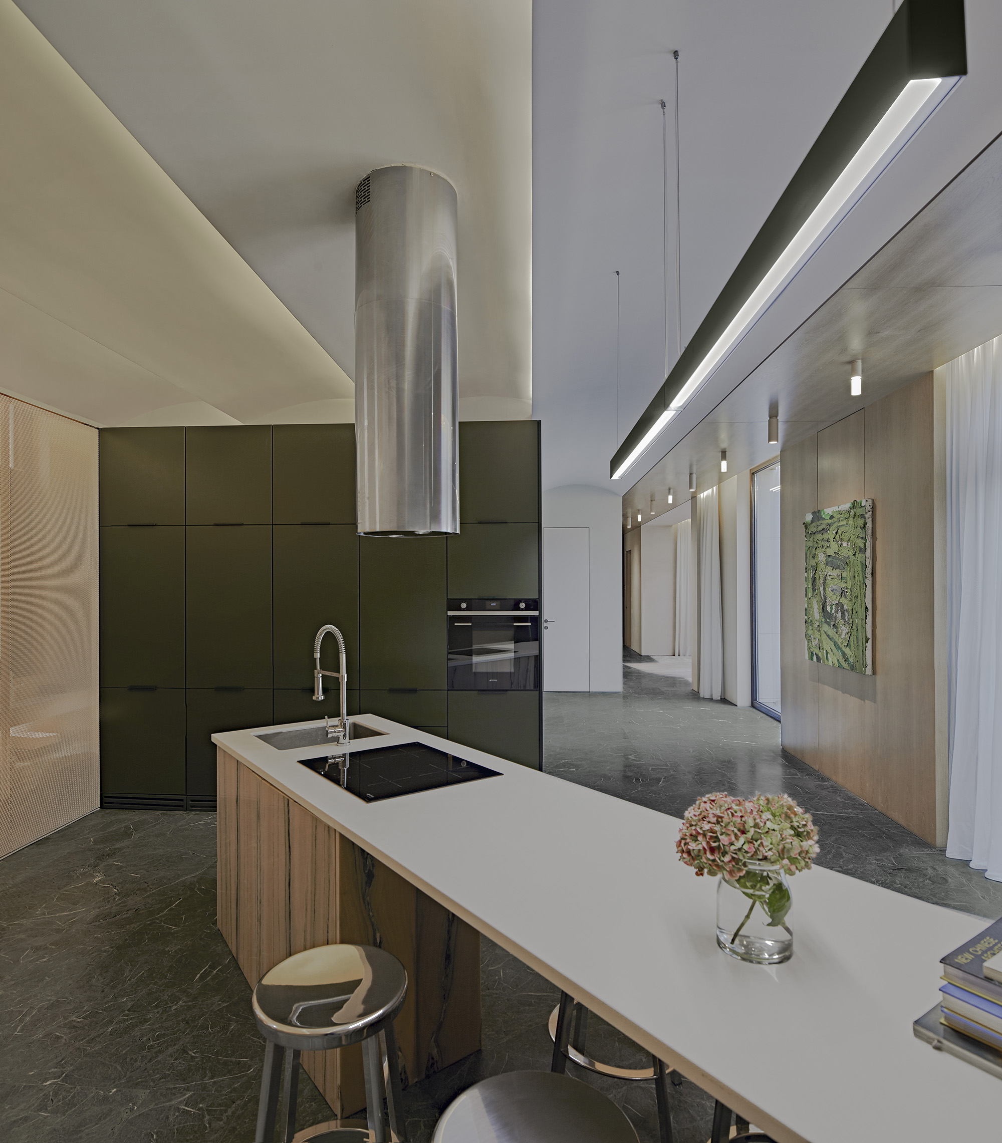
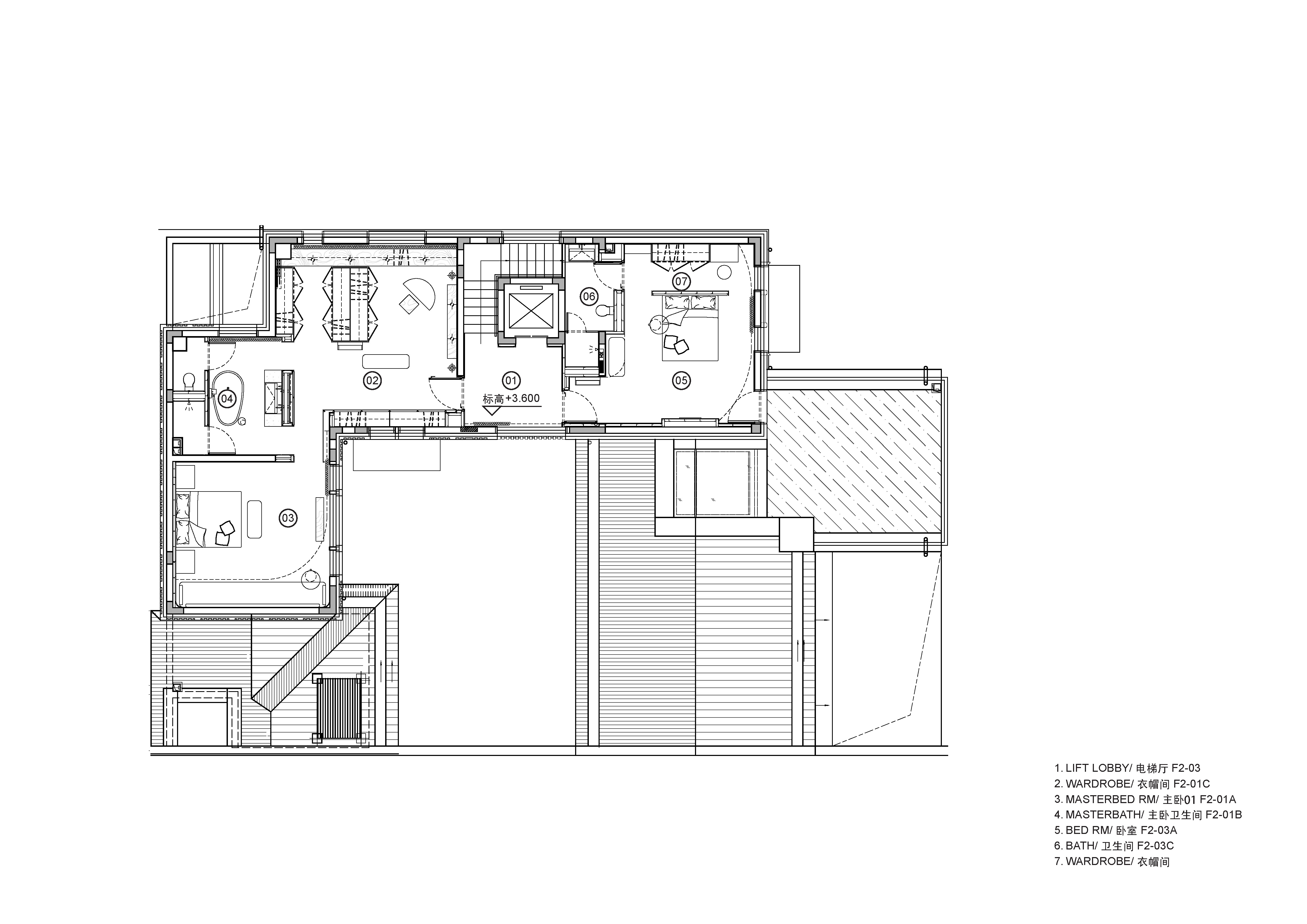
- The home sacrifices economic benefits through reducing a maximum of 8 bedrooms to 4 on the upper level of the home and utilizes the additional reclaimed area for lifestyle functions. It also uses an unusual dual kitchen combination. One open western Kitchen/Breakfast Bar on the ground floor adjacent to the master bedroom and reception room encircling a exterior courtyard garden. The second Chinese kitchen is in hidden in the basement Connected to a large Exhibition/ Living room flanked by an Exercise space and swimming pool. A Fine Dining and entertainment bar complete the raised viewing gallery encircling the Living space.
- All effort was made to maintain visibility through all social activity spaces, with coloured glass partitions helping to reduce the solidity of interior spaces. 3 types of glass were used transparent, frosted and opaque. The intensity of pigment was carefully chosen to match each function and achieved by the use of transparent film sandwiched in-between two laminated layers. Privacy was kept to a minimum and enabled with frosted utilized in the bathroom and Opaque glass with built in furniture’s.
- Removing clutter required large expanses of built in storage. Transparency was further used to reveal objects stored behind through perforated metal sliding and hinged doors. Many of these areas appear to be plain walls but depending on the choice of lighting configuration can have a greater transparency.
Why Should you win an award
A designer desires to awaken instinctive emotions, likes and dislikes from inhabitants, but the feeling of indifference is a sign that ownership is not yours. A universal failing to address the individual, one which waa considers a current failure of home building to be addressed.
An urge to collect paraphernalia is a natural instinct to help with the temperature. This market vernacular helps make a house a home, it highlights the person’s orientation and quirks and character. However in our current climate of endeavoring to reduce consumption would a more effective strategy, to express our sentiment be, to treat the bones rather than paint the nails? It is not our desire to go against the human need to make our mark. It’s an attempt to imbed these emotional connections into the holistic core fabric of the building.
The refurbishment of the 900sqm house originally had a traditional plan layout with multiple rooms. Part of organizing the temperature required an extensive structural re-build. Sacrifices in the plan by the client enabled the unorthodox configurations and emphasis on social places within a home. These can be neglected where places for reflection and emotional wellbeing can give real benefit when socially distant from the outside world.
Everyone’s expectation of home is not the same. Of the world around us the designer’s use of space to form place has the strongest power to influence our emotional happiness, stimulate positive emotion such as joy and calm, and increase social engagement throughout the home. In doing so it loosens our bond with objects and the need for them as an expression of identity. Rather, this home embraces temperatures of colour as a generator for concept, and amplifies these palates of emotion through the projection of light.
