2021 “Beijing Sub-Center International Young Architects Forum”/Emotional Architecture
Good afternoon, everyone. Thank you so much for having me. I am very happy to share Waa office with you. Waa Design was founded by my partner in 2010. We have been working in Beijing for 10 years. Today I want to talk about our ideas, how we embed emotion in architecture.
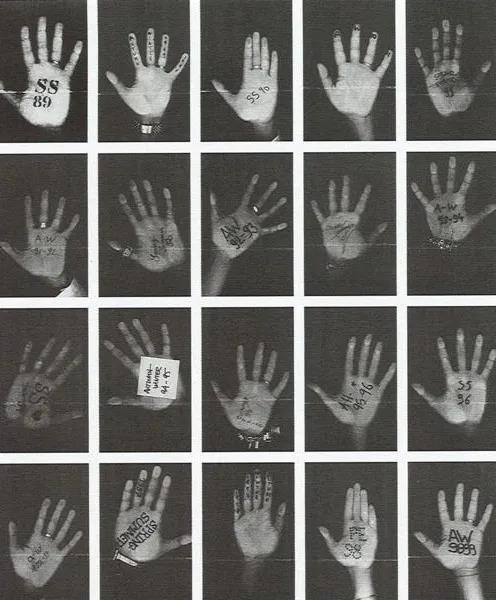
This is a creative image from French fashion designer Martin Margelia. She uses the hands of her designers to form a self-portrait. I think it’s a great example of collectivism and how anonymous teams really work behind the scenes in architecture firms. We want to delve into what brings cultures together, what brings us together. In a sense, the relationship between culture and human senses transcends race and reaches consensus. We want to put people at the heart of our building. We want places to make sense. Therefore, in order to make these places meaningful, we need to stimulate people’s senses in their experience of any building or space. Hopefully this will make a place meaningful to any visitor. It’s kind of like a script. But architecture is obviously a little more complicated.
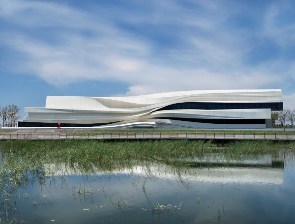
The first building is a large-scale building in Yinchuan, which tells the story of a landform. There are plans for a new development on the banks of the Yellow River outside Yinchuan, a 16,000-square-meter art facility that will truly focus on China’s Silk Road and other cultures along the route. It is also a wetland park for migratory birds. This is the first building to be built on site. The site is close to the Yellow River and the city center. So we wanted to give the building a local identity. How do we do that? We thought about making the building local by shaping its environment. In the past thousands of years, the Yellow River has moved a long distance because of the flow of silt on its bed. This diversion process releases upward forces from the sedimentary rock, which can actually be seen in nearby mountains. So we wanted to think of this building as a fossil of the earth. Enter through the hatch door at the back of the building and pass through the grand staircase to a sunken gallery space, where many large installations make the area relatively dark. As you go up, the materials of the building become smoother, and the great atrium brightens the light. Finally, one exits the building from the geometric facade through a long ramp. We wanted to introduce the exterior into the building. Therefore, we used a geographical study method, which helped us extract the dimensions of the panels. We also decided to stack the panels to allow people to merge with nature. We use parametric techniques to model buildings, but we use very low-tech methods to model them. After that, we marked each panel and then manually polished them to fit the adjacent panels. There are 1,600 individual panels in the museum. We condense all the unique contour types into a cabinet as a testimony to our experience of building this building and call it our Emotional Cabinet.
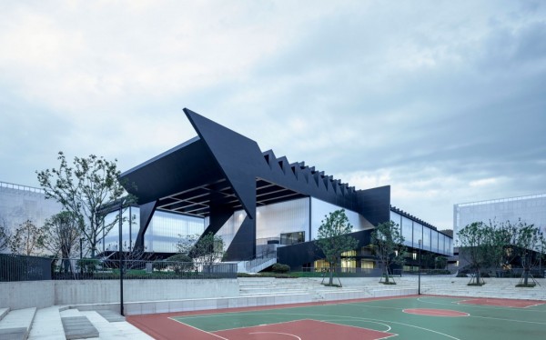
The next project is Eagle Studio, an 80,000-square-meter art institution designed to help young children pass the gaokao. So it happens every year for them, they recruit students every year. The environment was originally artificially lit and the students spent a lot of time in this space. We want to try to give them a better life while they get education and outdoor activities. So we wanted to try and create a collective space for them to feel united around their common artistic interests. We decided to highlight the main nodes around the circulation space, which would become important nodes for daily or impromptu meetings between students. The entire building is vertically divided, with a restaurant in the basement, some amenities on the ground floor and offices on the third floor. At the top are four classrooms that are lit up as art Spaces. Because of these nodes, we create balconies and Spaces where people can communicate and see each other. It’s like a three-dimensional grid, and people will be able to communicate with each other on that day. We also want students to own some of these Spaces and collectively own them. Another very important point is to improve the quality of life for every student. We felt it was very important for us to have light facing north. North lighting is the gold standard for painting. As a result, large skylights across the entire roof were introduced, with the main entrance on all sides. Dormitory buildings are all around. On the top floor is the artist training Center, which these headlights serve. And here’s an image of the painting studio. There are plenty of rest Spaces behind the classroom for work and rest. We also made special VIP entrance and passage.
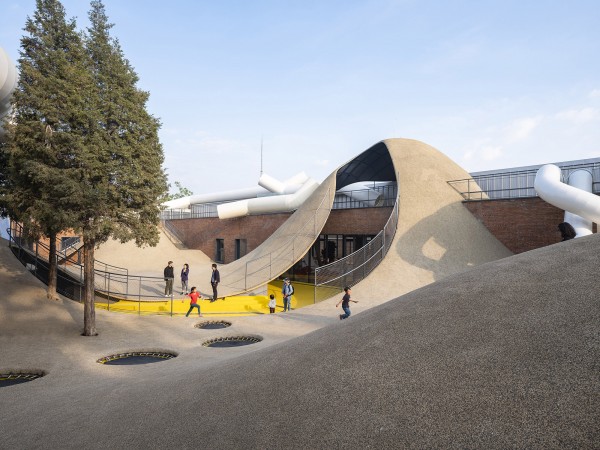
And finally, there’s a program in Beijing called the Child Growth Center. It was commissioned by a medical centre that focuses on child development and growth and movement. What we really want to try and target is the problem of downtown living, and a functioning community. This is an area renewal in north Beijing, and our building is an old storage facility. The building itself has two main functions, two main elements, which are the pipes on the mounds, the pipes that we spent a lot of time building on site. We’ve spent a lot of time looking at the ergonomics of children’s Spaces in relation to adults. And mounds are very important because they help test children’s movement and balance, which is one of the senses I talked about earlier in the talk. It also enables the client to reclaim almost 500 square metres below this courtyard, so its value is even higher. The mounds are covered with an efficient transportation system that is incredibly impact-resistant. We have five different ways to create a more attractive play space for children. One is to provide them with a hidden leadership environment. The other is to create Spaces that only children can reach. As a result, they are very small even under mounds, in pipes and chambers. We also have a place where there is an element of fantasy, but not so much that children can’t use their imagination. We wanted to create a maze. So children can learn that the fastest route is not always the best. Sometimes, the longest route is more interesting. Children can use the slide, use the mound itself and climb up the entire building along the entire roof. We use pipe stack. Like I said, the most important thing for us is body awareness and the connection with the kids to develop their sense of movement. We also embedded these ideas in the interior space. So we have a range of climbing and sliding Spaces. The most important concept for us is to make kids feel like they can control their risks and how they want to grow up on the playground.
